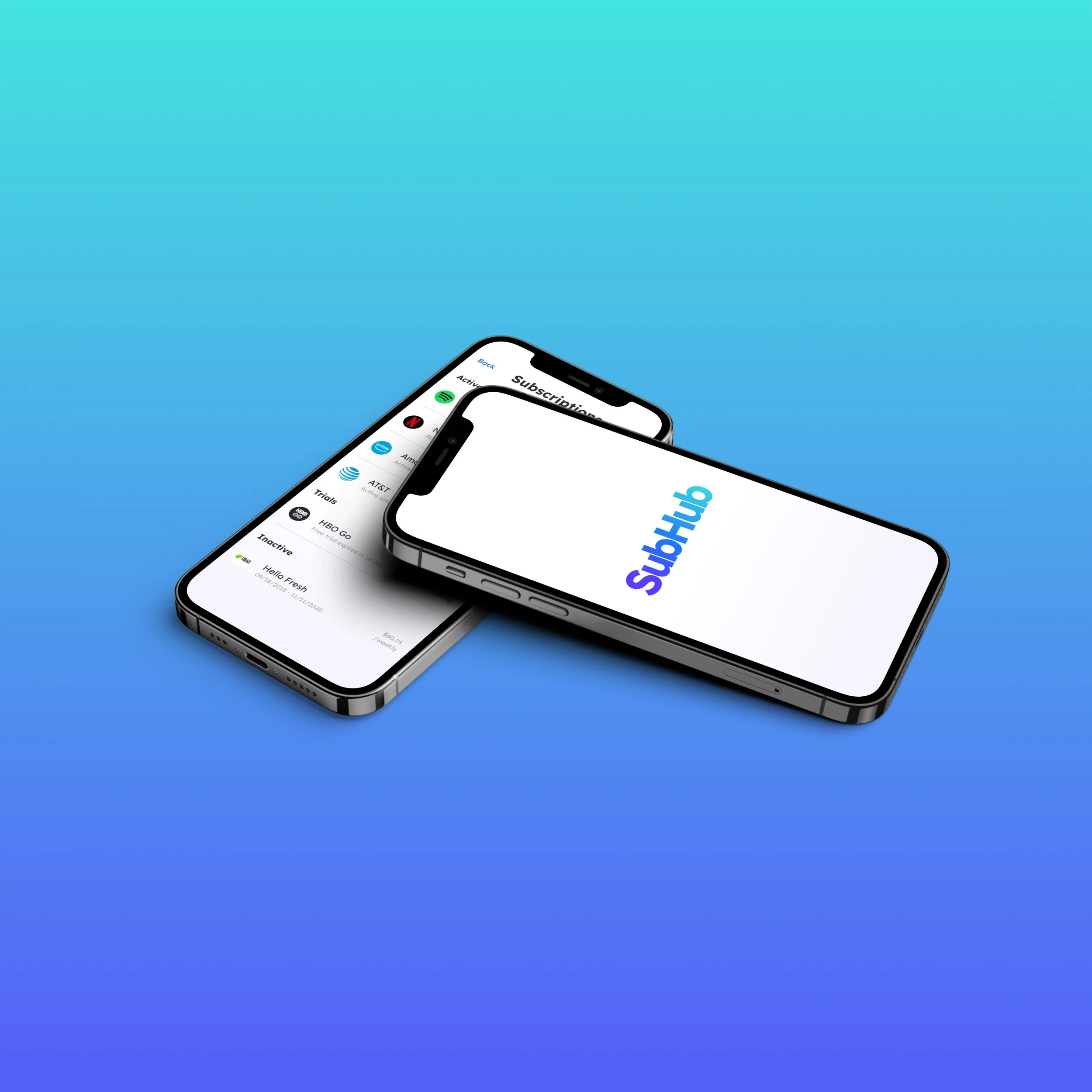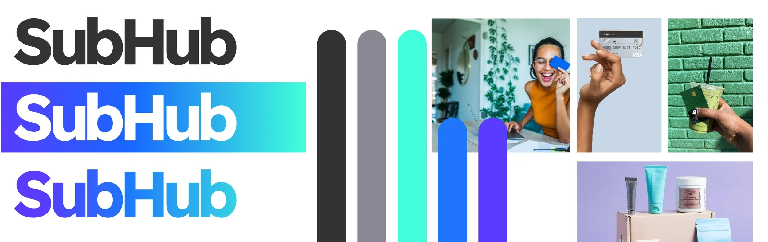
SubHub
Subscription tracking services can be a great tool to help track and view monthly subscriptions. SubHub excels where other subscription tracking services fall short. Welcome to the future of spending. Welcome to SubHub.
My Role
As the only product designer working on the project, I developed a complete user experience for SubHub. Through different important discovery and design phases, I created this app to help users track their subscriptions and improve their financial management.
Problem
Many subscription services require a bank account immediately, charge a monthly fee based on the number of a user’s subscriptions, or don’t offer options to help keep a user’s budget low.
Solution
SubHub allows users to see and leave ratings and reviews on subscription experiences, be notified of upcoming charges, track budgets, and cancel unwanted subscriptions and trials… all within the click of a button.
Key Phases
Primary UX Research
Secondary UX Research
Personas
Sketching & Low Fidelity Wireframes
User Interface Design
User Testing (Round 1)
High Fidelity Wireframes
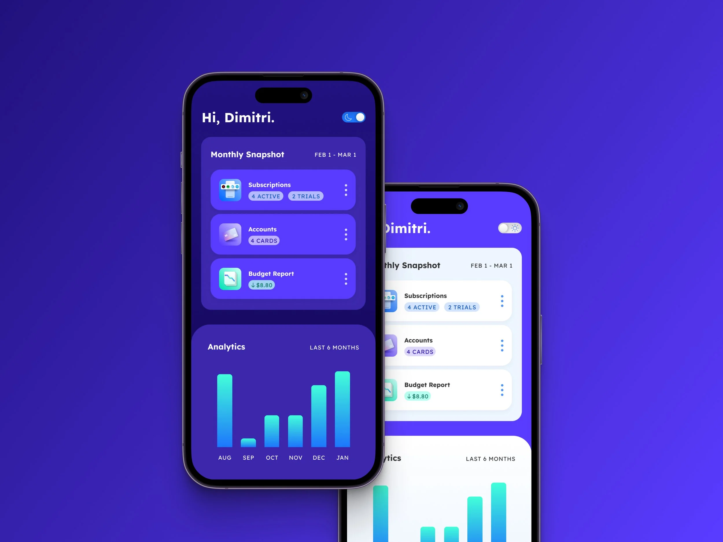
Dark Mode
Gallery
Primary UX Research
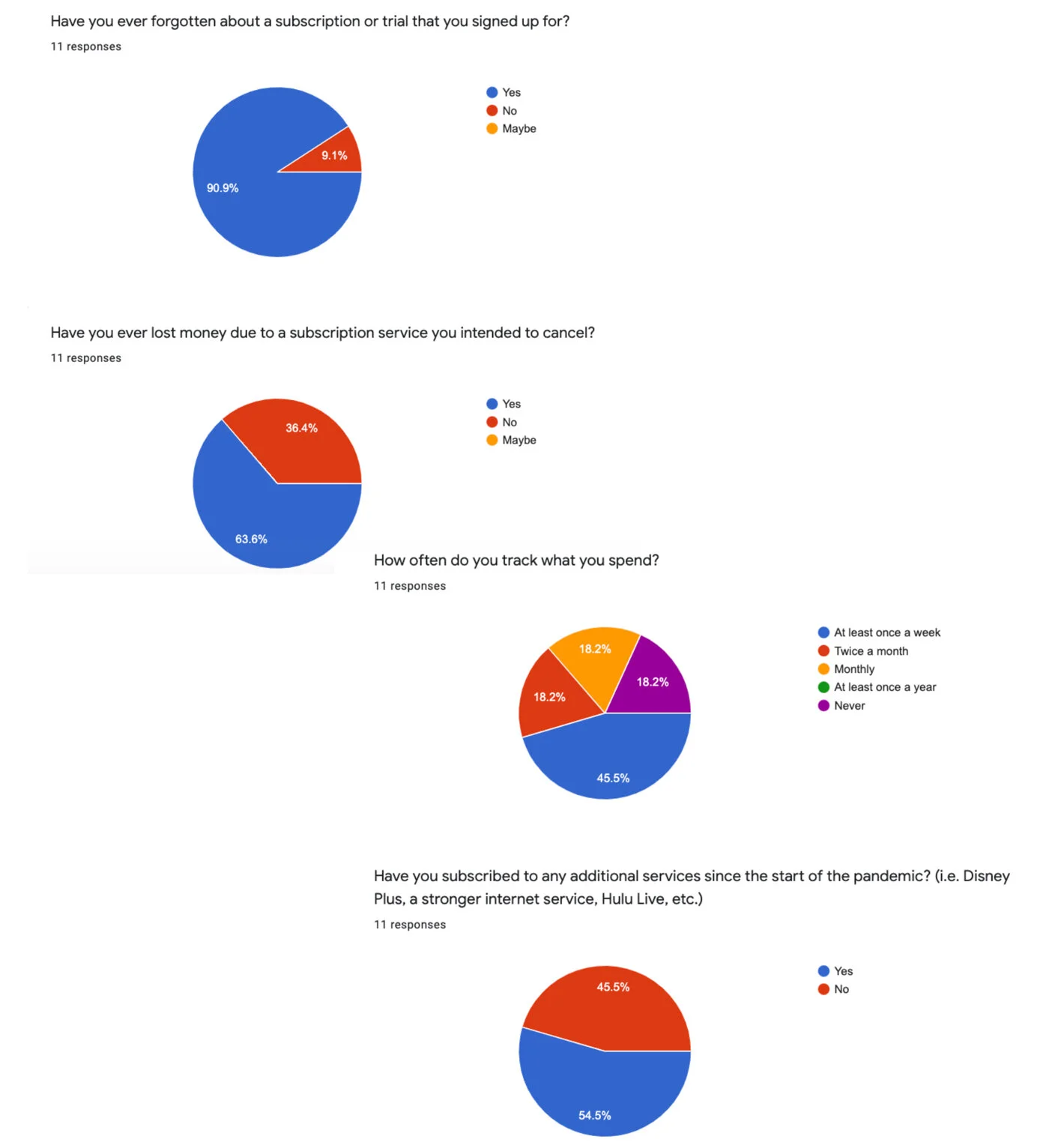
I conducted primary research through a brief survey to the everyday subscriber and gained valuable feedback on what they were looking for in an application like SubHub. This gave me an idea of who would be using this application and a deeper understanding of common user pain points.
Key findings from my primary research:
Users have signed up for more subscriptions since the start of the pandemic
82% of surveyed users track their spending at least once a month
50% of surveyed users track their spending weekly
91% of surveyed users have forgotten about subscriptions they signed up for in the past
64% of those users have lost money to services they intended to cancel
Secondary UX Research
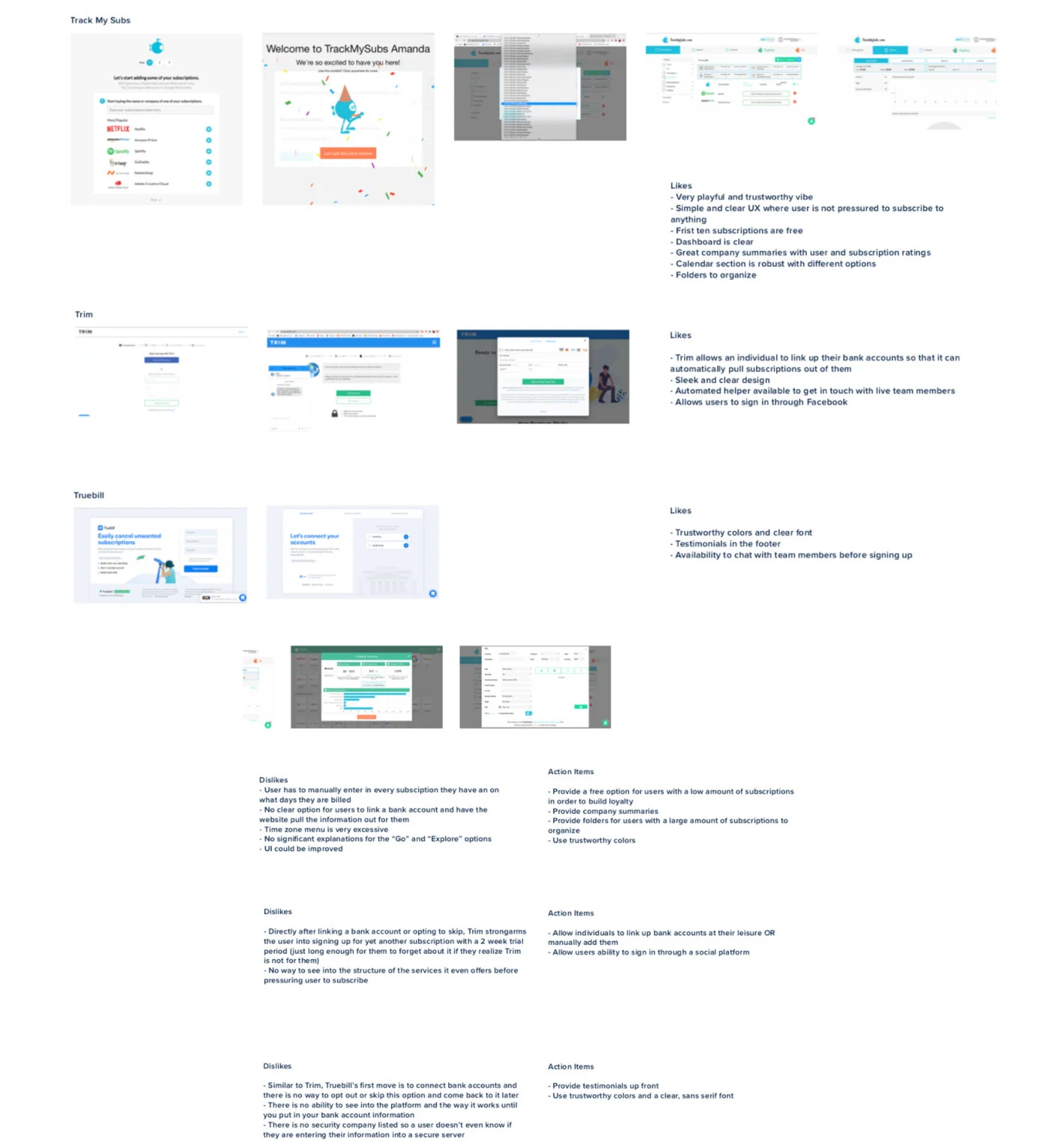
I conducted secondary research through a thorough analysis of other competitive subscription applications such as TrueBill, TrackMySubs, and Trim. I then identified the top attractive and unattractive qualities of these services and contributed purposeful action items that would be valuable additions to SubHub.
Top attractive qualities:
Company summaries with subscriber ratings and reviews
Trustworthy and friendly UI
Bank account attachment to pull in subscriptions
Folders to organize subscriptions
The ability for users to sign in through a social platform
Top unattractive qualities:
2-week trials for users to track subscriptions before auto-renewal
Forcing users to link bank account when they sign up
No tutorials or walkthroughs for users upon account creation
Users have to manually add every subscription and billing date
Personas
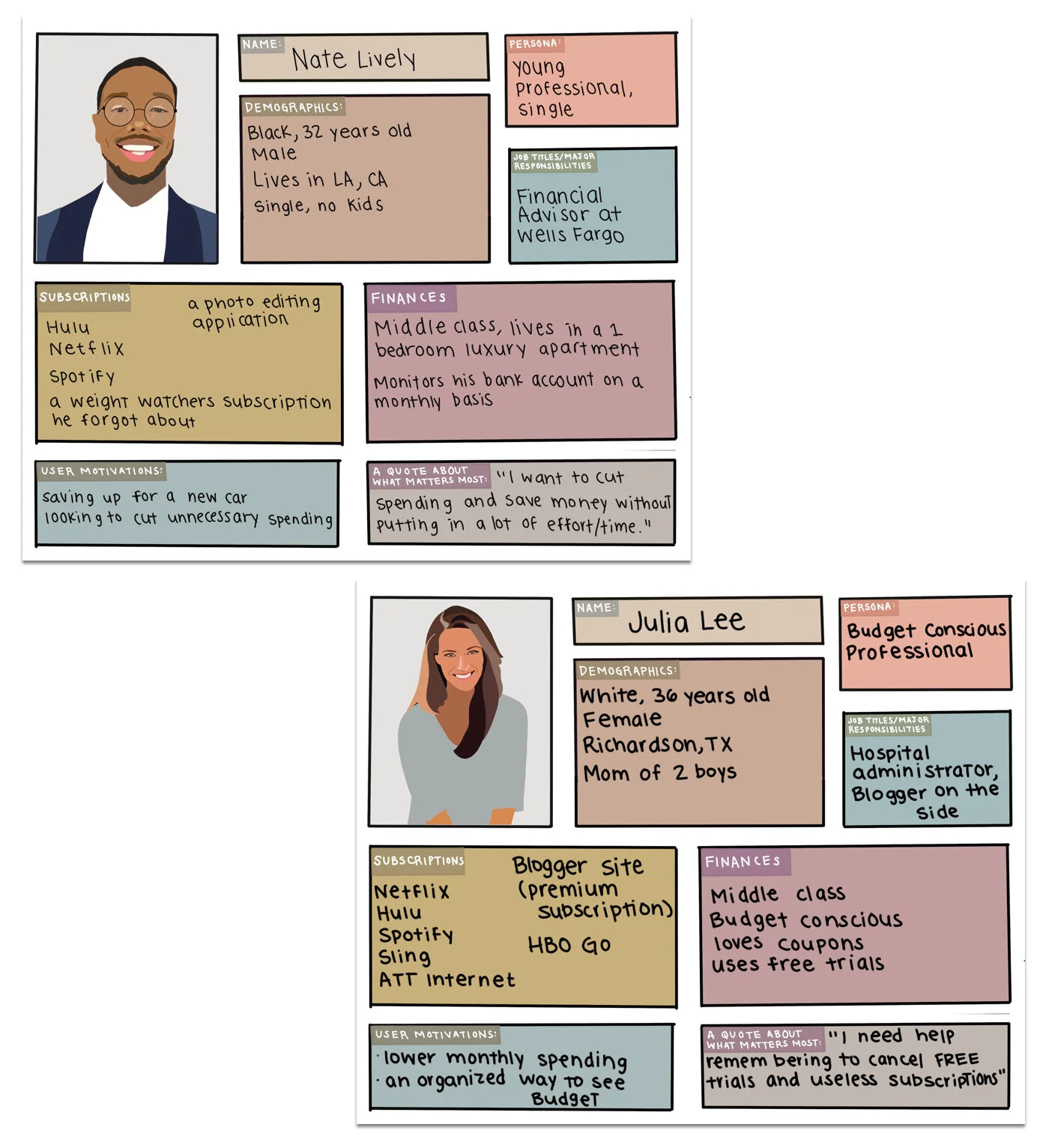
After analyzing the survey results, I developed two personas: Nate Lively and Julia Lee. These personas contained characteristics that reflected the everyday user of SubHub. Both personas had their own sets of needs, ambitions, occupations, and subscriptions.
Nate is a young and single professional saving up for a new car. He is looking for ways to save money, but he finds it difficult to keep track of his spending.
Meanwhile, Julia is a busy mom of two. She has an established career, a side hustle, and her kids. It’s easy for Julia to forget about subscriptions, and she needs help remembering to cancel expired trials and services she no longer needs.
Throughout my design process, I kept Julia and Nate in the forefront of my mind, constantly referring to them as I began my design processes.
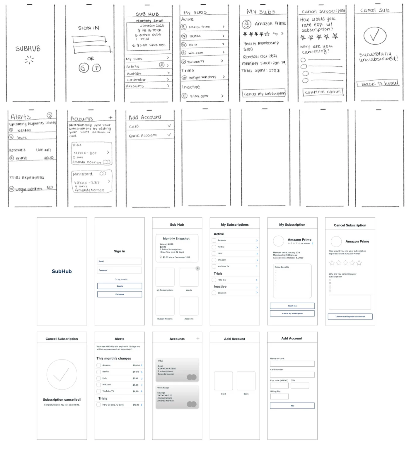
Sketching & Low Fidelity Wireframes
Upon conducting my research and establishing my personas, it was time to put pen to paper. I began to sketch the most basic pages of my application. After creating dozens of different application layouts, I felt confident with my designs. I pulled them into Sketch and began my low fidelity wireframes.
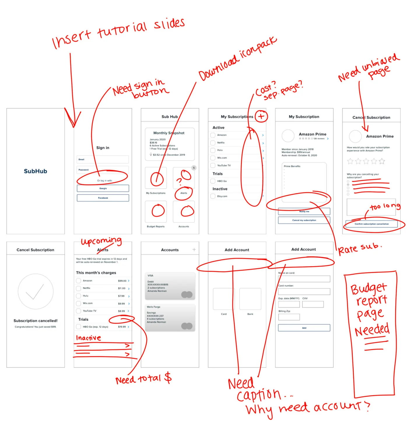
User Testing
Once I had completed the first round of user testing, I was able to see areas of SubHub that needed proper refinement. Multiple pages needed to be added, and there were minor copy and layout adjustments as well. The feedback I got was incredibly helpful and launched me into my next (and favorite) phase: user interface design.
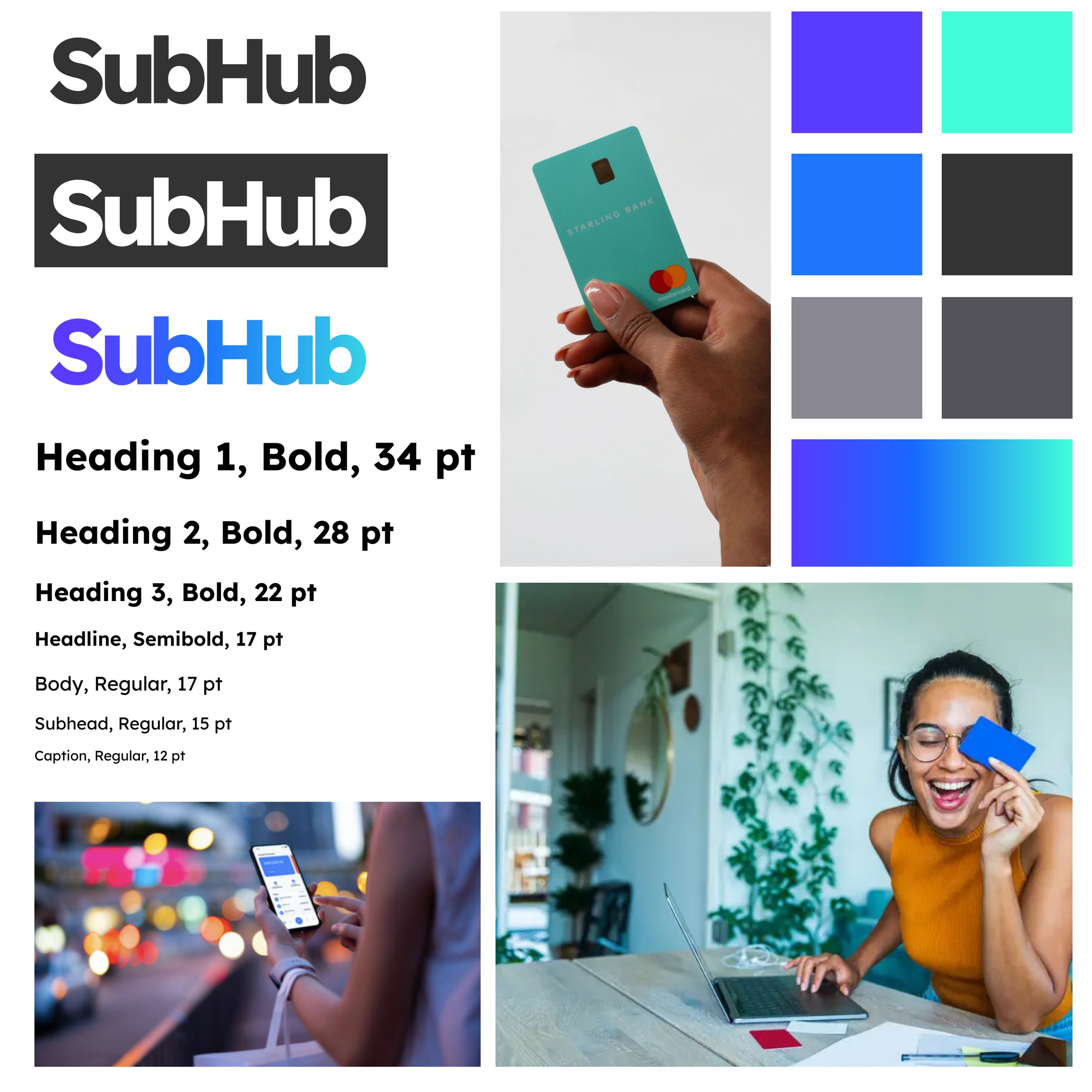
Cool tones are seen as safe and reassuring in the eyes of the user. Blues symbolize trustworthiness, friendliness, loyalty, inspiration, freedom, wisdom, and intelligence. Bright and vibrant colors, such as the chosen purple, help motivate and energize the user to take control of their finances. With these colors, SubHub’s brand values are echoed to the user. I chose Lexend, a sans-serif font, for the application, as it is easily readable on a variety of devices and visually appealing.
User Interface Design
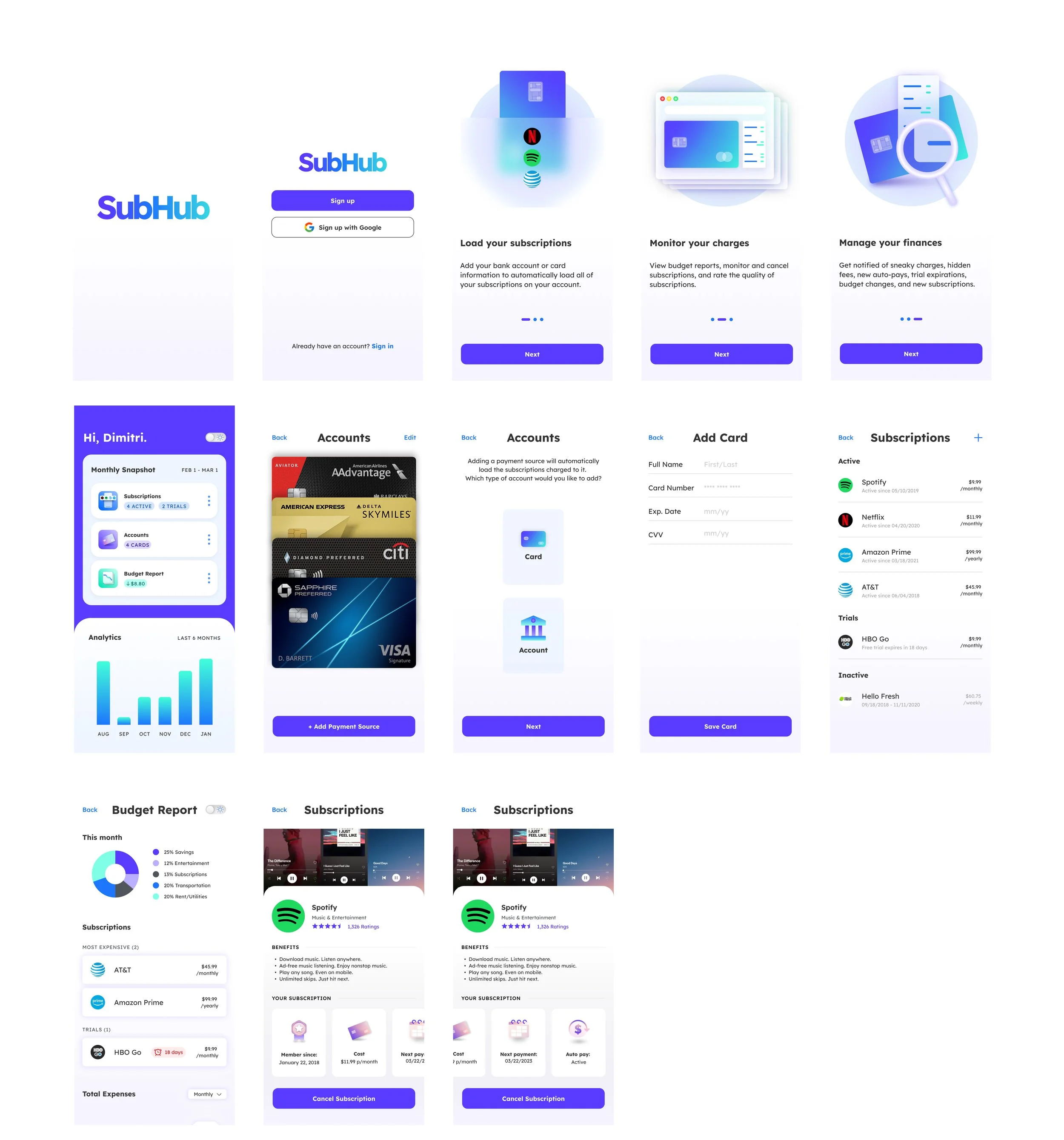
After strategically choosing the visual elements for SubHub, I implemented them into my wireframes and iterated the pages based on my feedback from the first round of user testing.
Added elements:
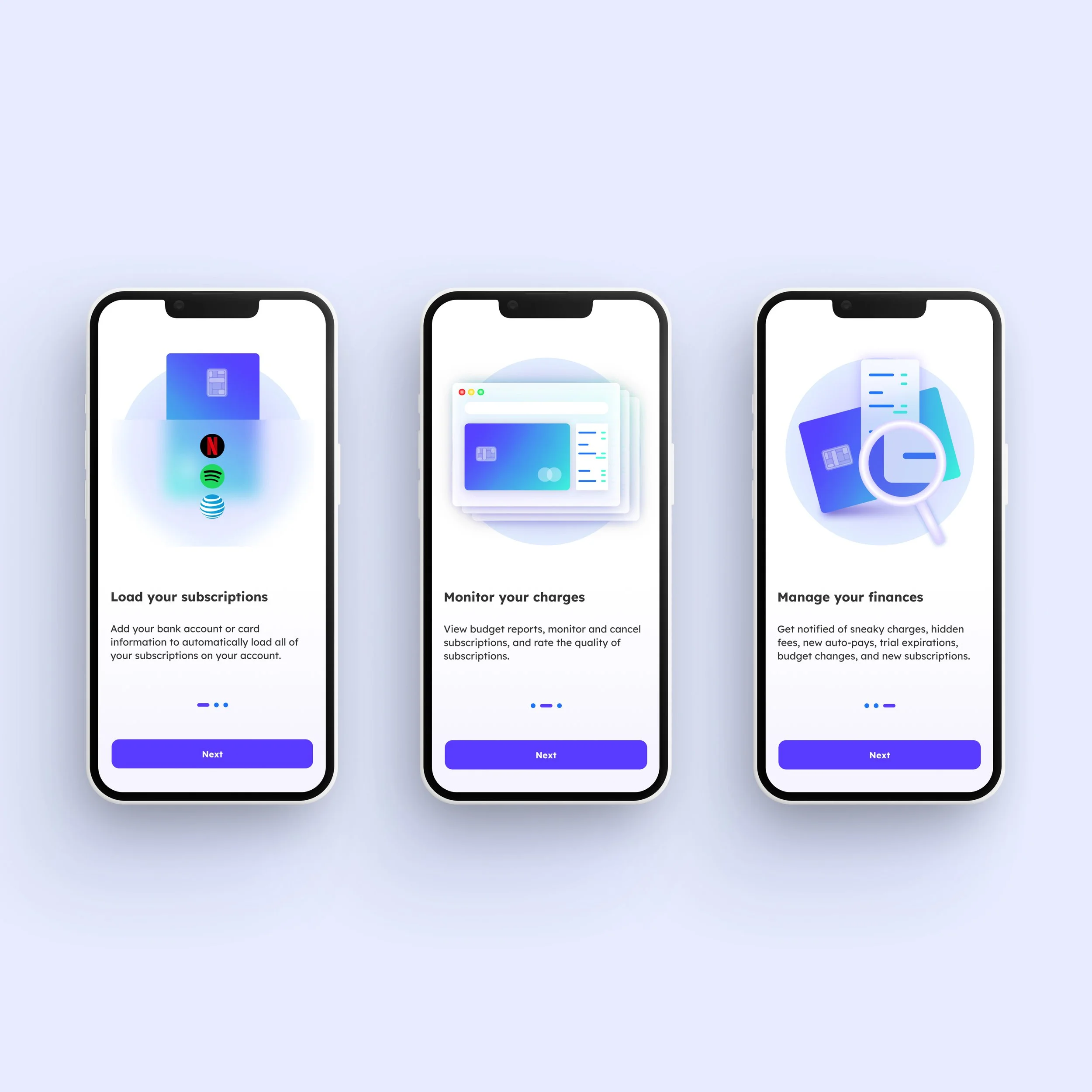
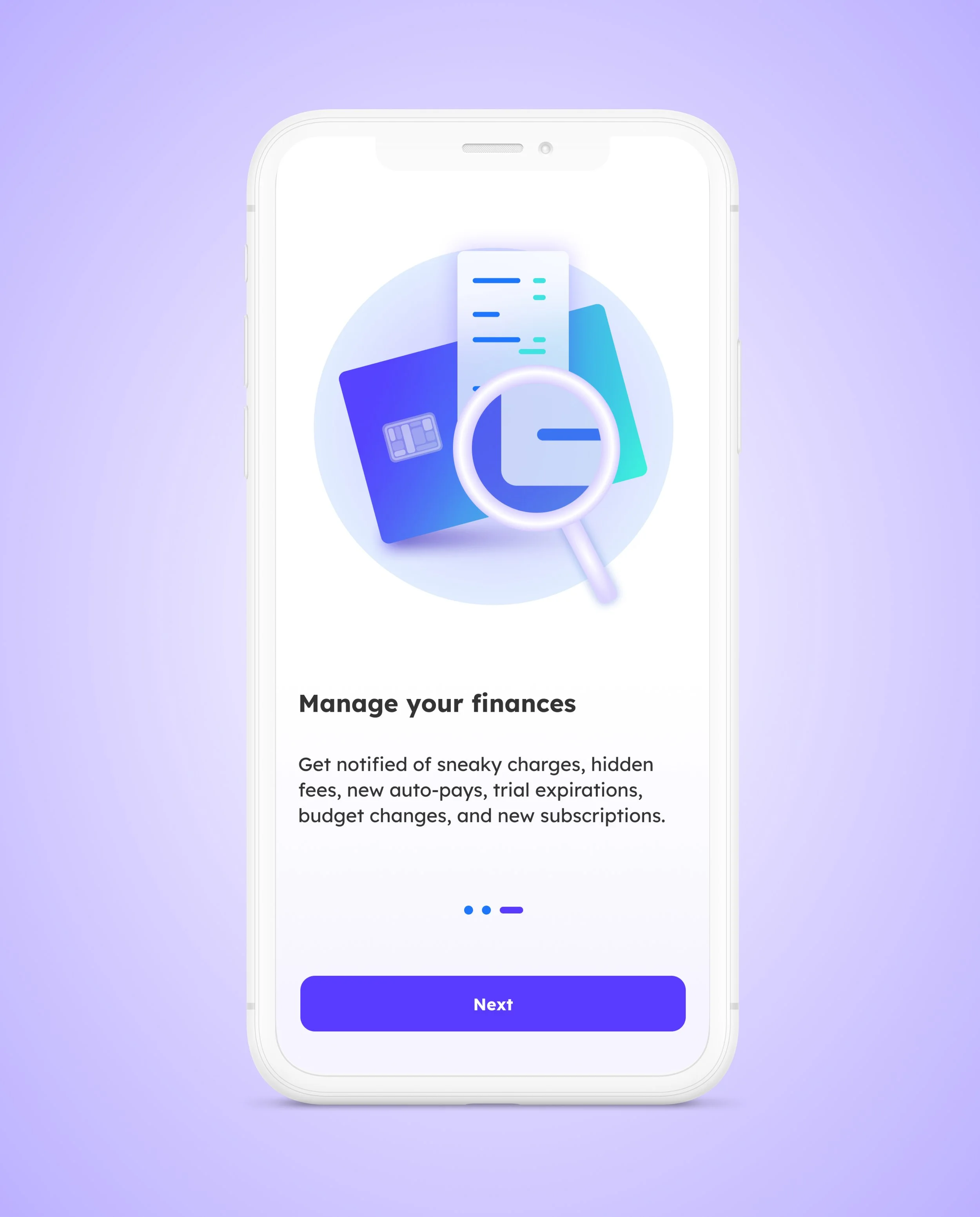
A tutorial slide deck at the beginning of the user journey
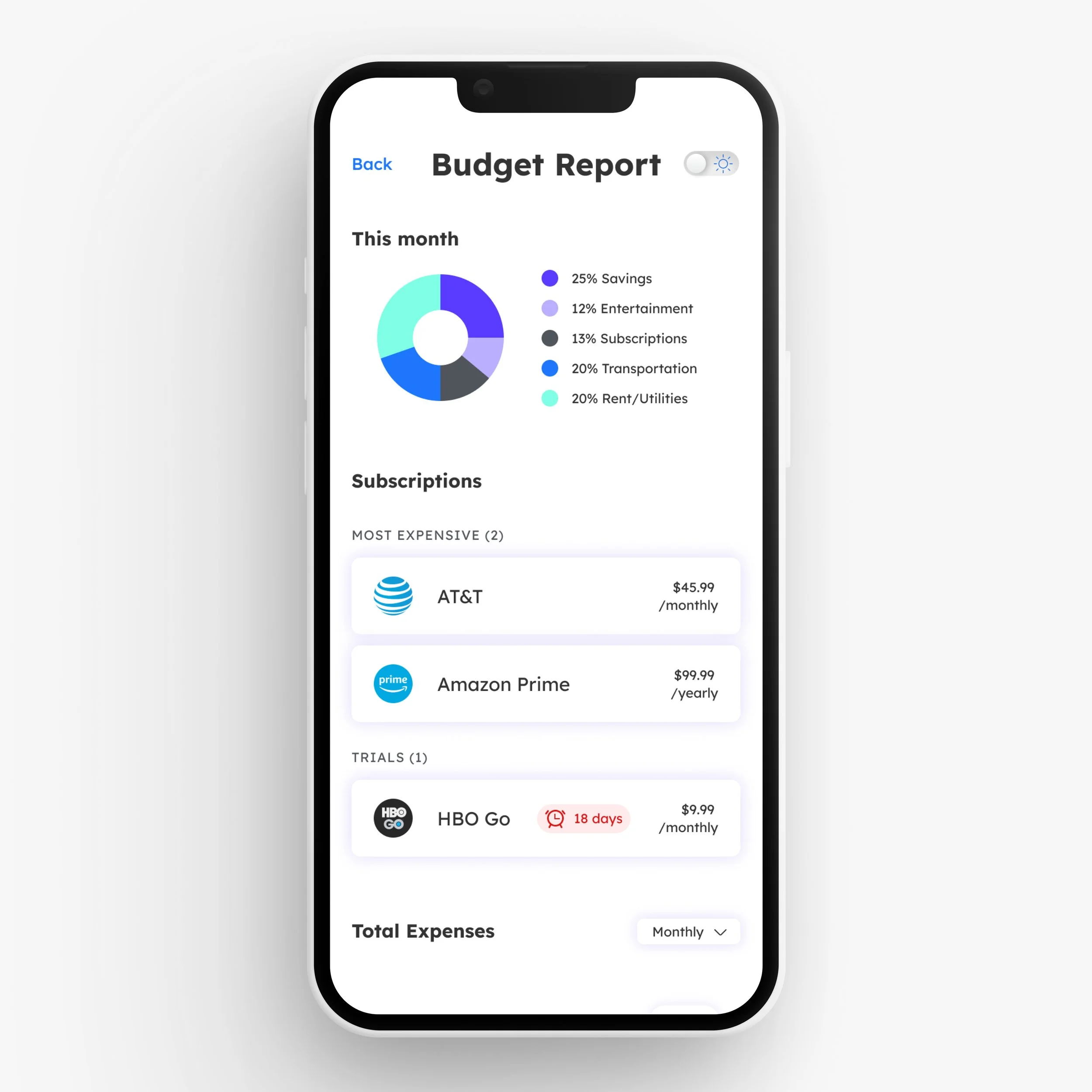
A “Budget Report” page
A “Rate” page
Copy on several pages
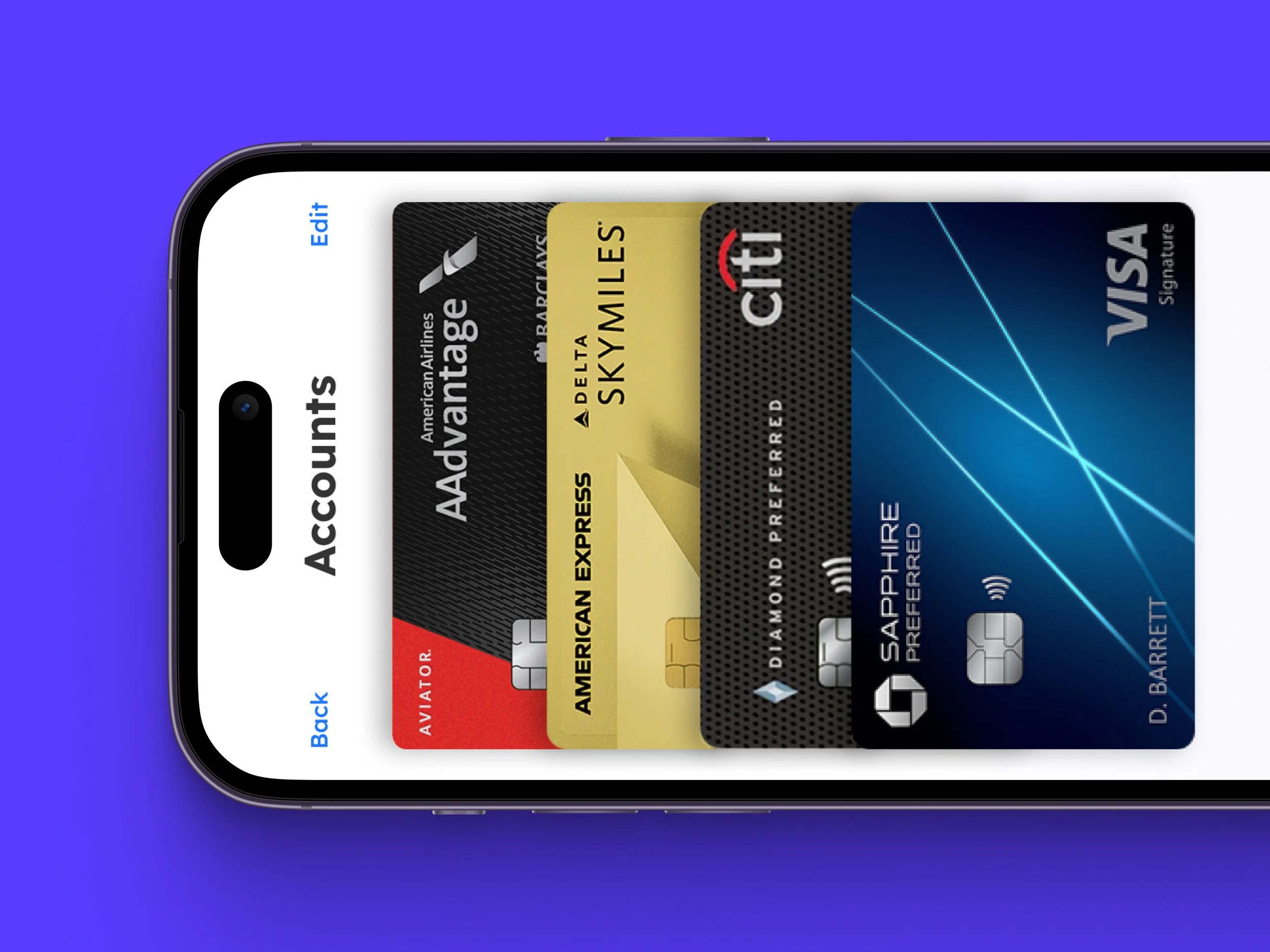
Visual elements on the Monthly Snapshot
Primary and secondary buttons
Iconography
UI
High Fidelity Wireframes
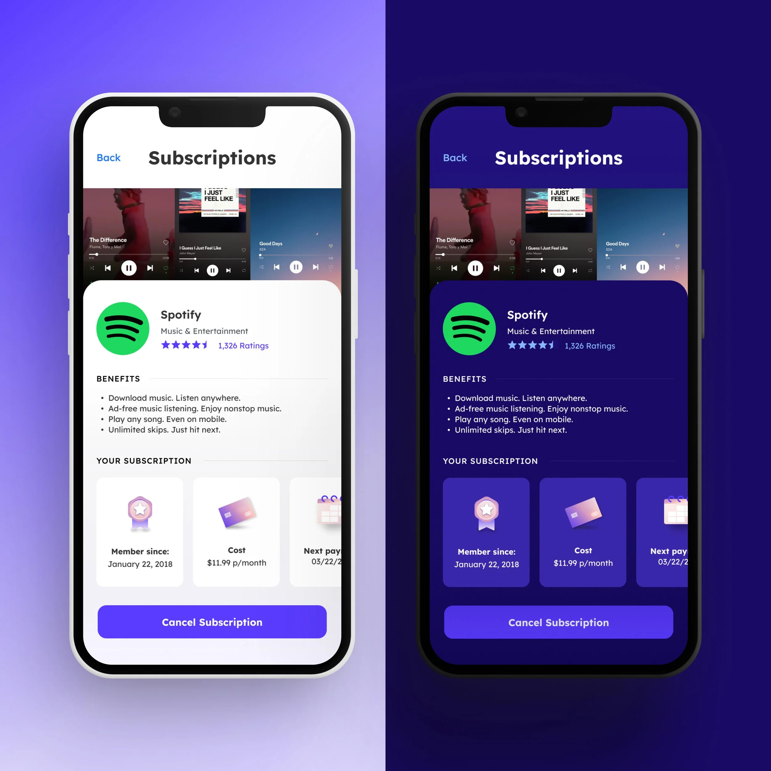
In addition to the classic and light UI style of SubHub, I wanted to explore this app in dark mode. Many users love to have their phones in dark mode at all times, and tend to favor apps that allow them to customize their interfaces accordingly. I maintained the vivid purples and blues, but also used deeper tones to create a more calming effect.
Dark Mode
Takeaways
Find the flaws in competitors.
The most valuable takeaway from my research involved sifting through the different competitors in the current market. I downloaded multiple applications and found several user pain points which SubHub aimed to solve.
The importance of color theory.
During my competitor research, I noticed the similarities in branding colors. The choice of blue is not a coincidence, as it is the ultimate color symbol of trust, loyalty, and relaxation. I chose the same colors to establish those brand values within SubHub.
Be different, but not too different.
I learned that it’s important to find what sets SubHub apart and share that with the user. At the same time, similarities are also important. The user needs to already feel relatively familiar with the style of the application before even creating an account. For instance, a user would be confused if SubHub was structured like an email account. Implementing the most important, familiar, and user-friendly flows from other applications helps the user to establish trust and feel comfortable with SubHub.