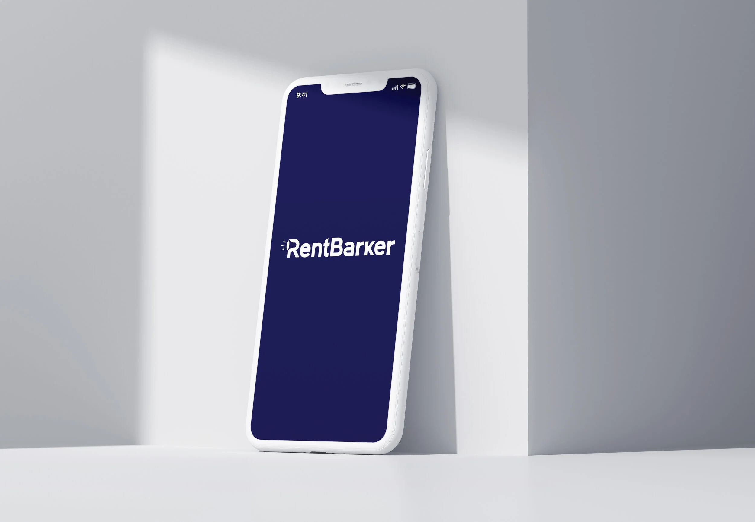
RentBarker
RentBarker is a patented startup in Dallas, TX that offers a unique platform for landlords to bid on tenants, streamlining the rental process. To speed up the rollout, some UX-UI phases were fast-tracked in a lean fashion.

My Role
As the sole product designer for the tenant side of the RentBarker platform, I collaborated closely with the UX/UI designer responsible for the landlord side to create a cohesive and user-friendly experience for both parties. Our design process involved frequent presentations to stakeholders, allowing us to receive feedback and iterate quickly. Throughout the year-long project, we worked closely with the development and marketing teams to ensure that our designs aligned with the company's vision and were technically feasible. Upon launching, I was responsible for auditing the site in its entirety to make sure our designs were implemented correctly. Today, our hard work has paid off, as the platform is now live and providing tenants with a seamless and hassle-free rental experience.
Problem
The leasing industry is outdated. Tenants are spending too much money and time on touring and applying for apartments. Landlords are spending too much money and time on unqualified tenants and leads. It’s unnecessary labor on both sides.
Solution
RentBarker simplifies the leasing process by marketing qualified tenants anonymously to the properties they choose and providing a platform for those properties to bid against each other to win the tenant. This way, the landlords get the best tenants, and the tenants get the best prices. It’s a win-win!
Key Phases
Visual Design
Copywriting
High Fidelity Wireframes and UI
Research
User Flows
Sketching
Low Fidelity Wireframes
Research
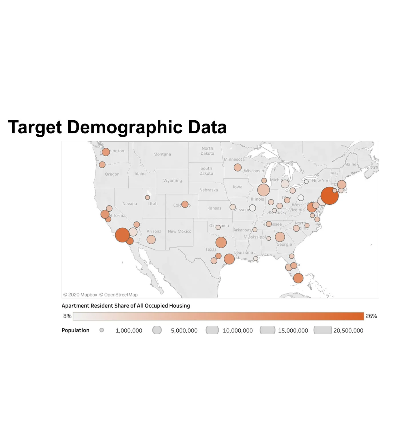
I conducted secondary research in order to gain insight into the key demographics of potential users on our site. I found valuable information on several reliable websites, compiled and organized it into a PowerPoint presentation, and presented it to the team.
I also attended a conference held by Apartments.com, where I learned about their marketing strategies, UX processes, advertising budgets, site development, upcoming algorithms, and projected target market insights for the upcoming year. Knowing who will be using our site is invaluable, and this information helped to steer us in the right direction.
While I spent the time researching the demographics and psychographics of potential users, other members of the team conducted their own research on the market and competitors. When combining the direct competition and market with potential users, we had enough to dive right in. Below are some of the most valuable discoveries from my research:
49% of renters are under 30 years old
23% of renters are between 30 and 44 years old
61% of renters have salaries below $50K
New York, Los Angeles, Chicago, and Dallas are the top four metropolitan areas where renters reside.
Apartments.com spent $250 billion on its upcoming marketing campaign.
63% of renters said virtual tours are enough to sign a lease.
Apartments.com will be launching a Zoom-like experience for people to virtually tour buildings with leasing agents.
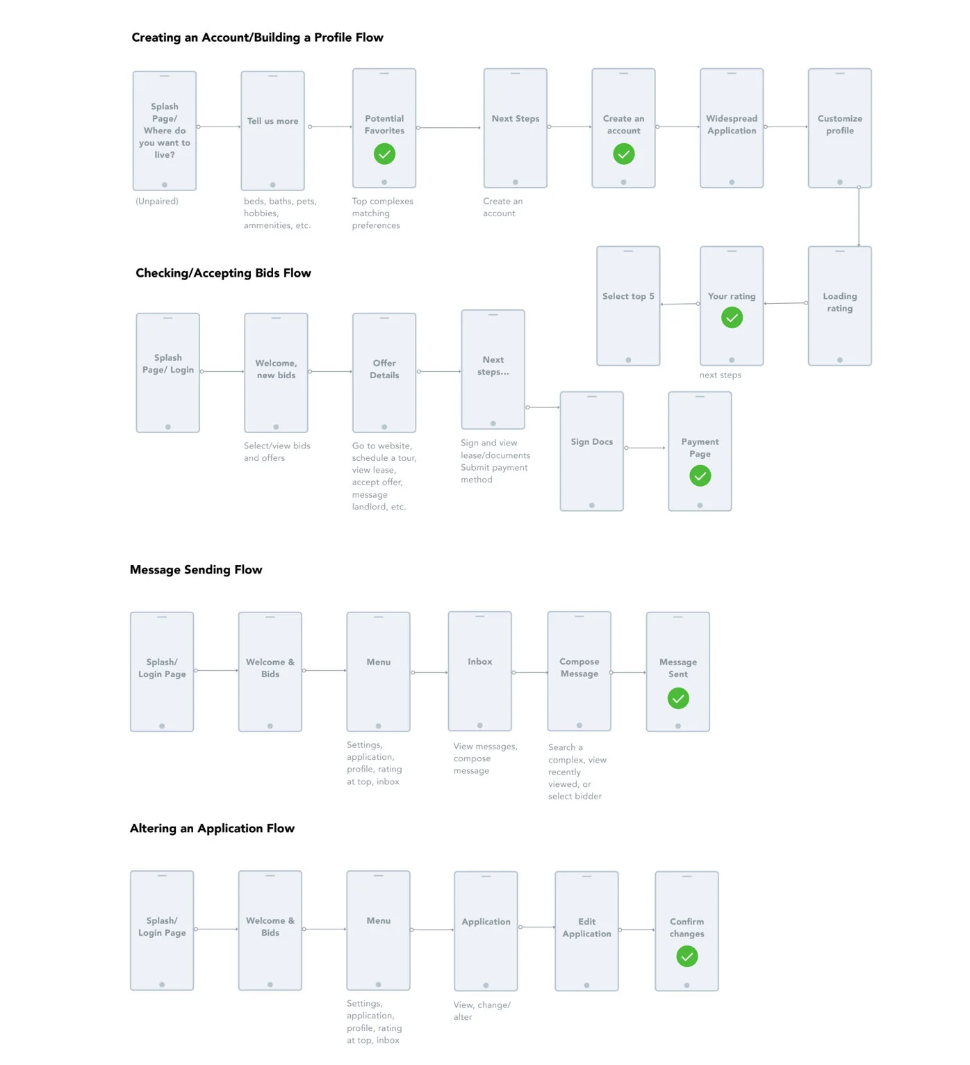
User Flows
Following my research, I created a series of user flows that contained key tasks for the primary users of our site. These flows included creating an account, checking/accepting bids, sending messages, and altering an application. As the project continued on, these flows were iterated, and more flows were added. However, these flows provided a great jumping-off point for the preliminary RentBarker sketches.
Sketching
Once the user flows were complete, the team immediately wanted to jump into wireframe design. I quickly sketched out the possible structures of each key screen on both mobile and responsive web devices. I did this for both the tenant and landlord user flows. We spent many weeks deliberating on the flows, researching further, editing structure, adding new pages, and combining old ones. Once we had decided on a very general structure, I moved on to the low fidelity wireframes.
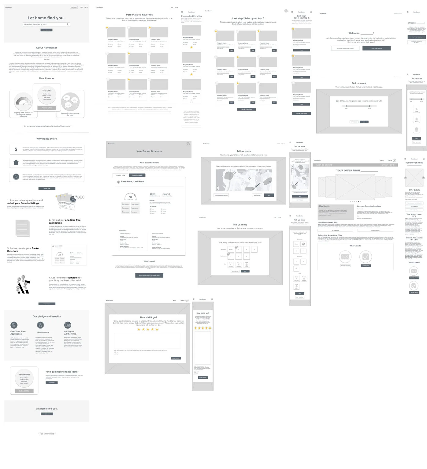
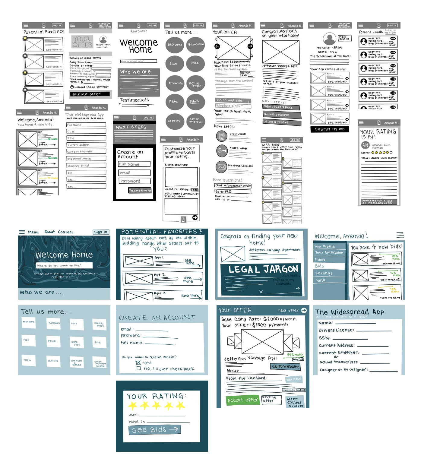
Low Fidelity Wireframes
I began the low fidelity wireframe process and was able to flush out some more key ideas that our team had not yet considered. We held long meetings, where I was provided with feedback, edits, things to take out, and more to add. These wireframes were iterated dozens of times over the course of three months before I began to move on to the UI and copywriting portions of our design process.
Visual Design
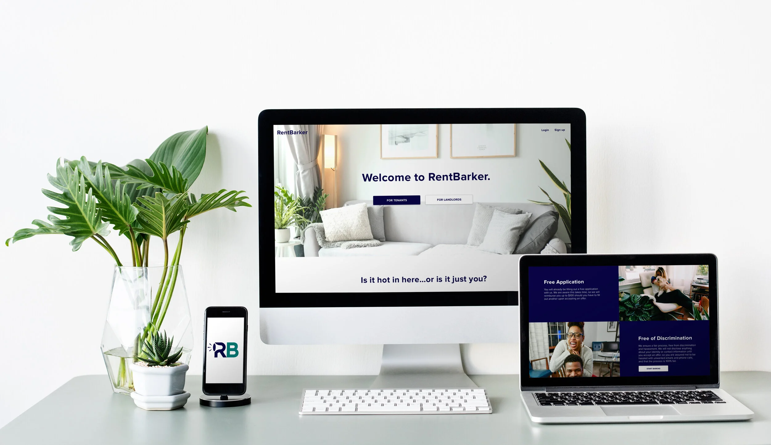
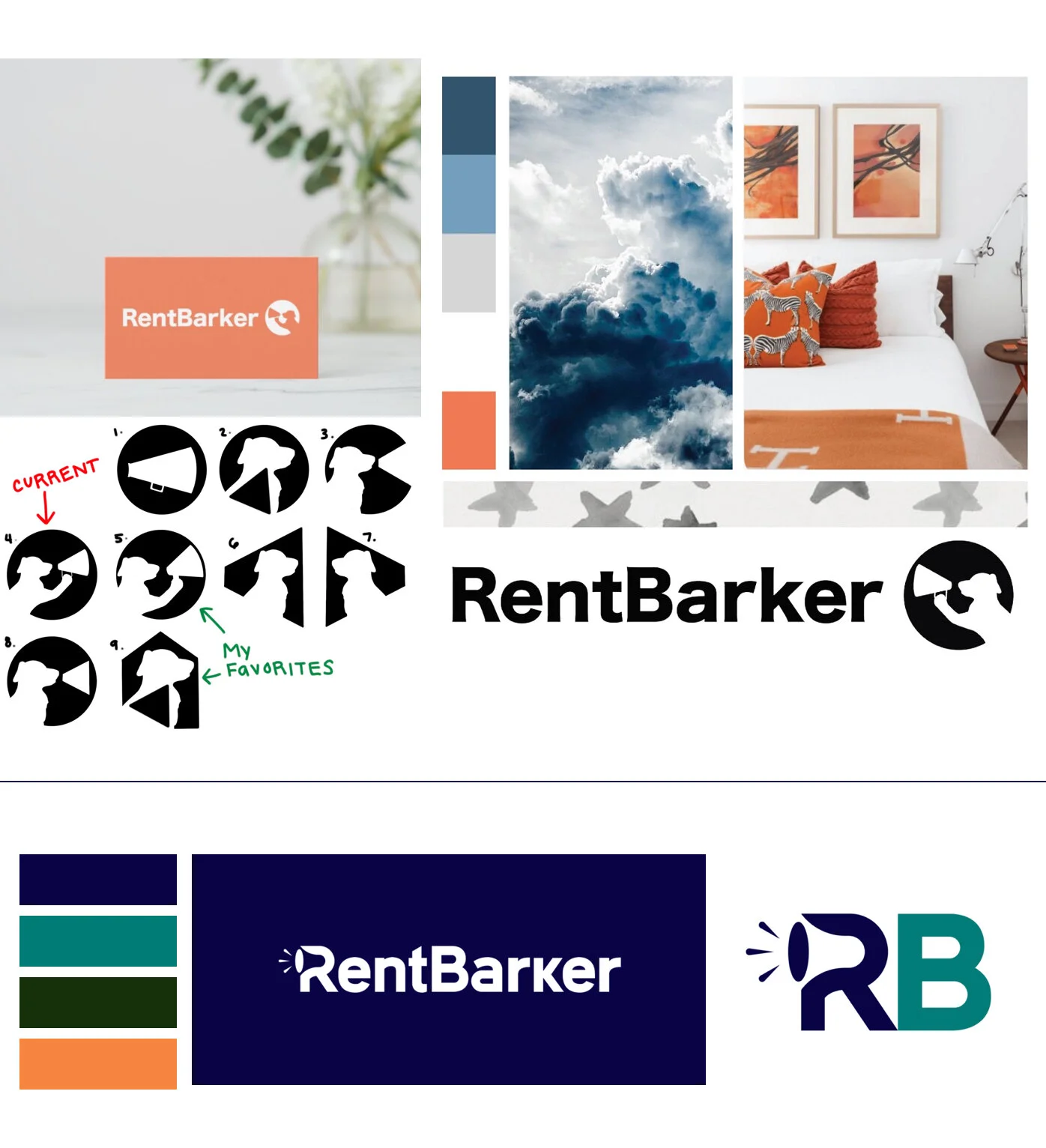
The team was anxious to move forward with the wireframes and transform them into something more tangible. I researched color theory and worked on a logo. I wanted our brand to be empowering and energizing to the tenant, but also trustworthy and reassuring. Shades of blue and orange were really important to achieve and convey these messages. The team was also passionate about having a dog with a megaphone in the logo, so I used the Crazy Eights design sprint method to quickly visualize my ideas that could incorporate both.
Months later on in our design process, we decided to outsource to a professional marketing and branding strategist and a graphic designer. The strategist helped us to refine our color palette, while still maintaining the orange and blue shades I had thoroughly researched. The graphic designer optimized our logo by taking out the dog and incorporating the megaphone within the letters instead. We were very happy with the outcome of the branding, and moved on to the copywriting.
Copywriting
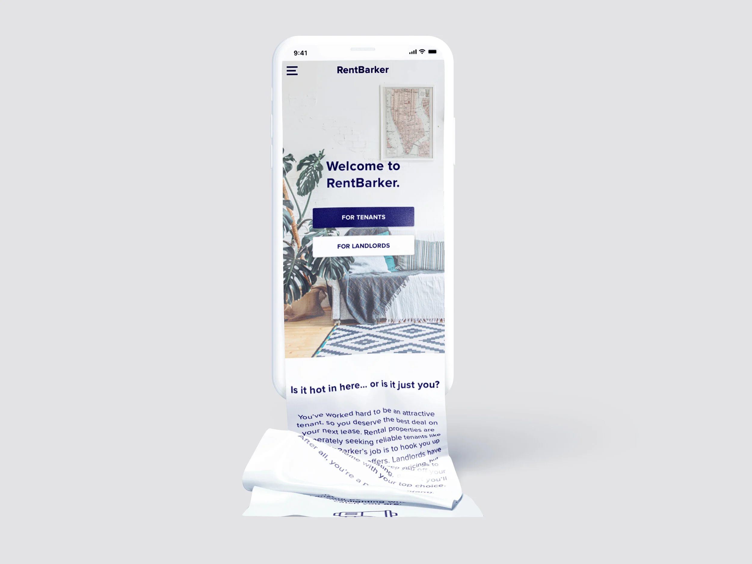
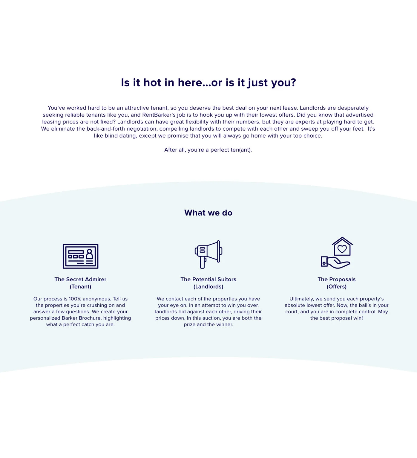
Writing copy for the website was a huge hurdle for our team to overcome. We passed copy back and forth for almost a year, and it is still in the works. However, I worked closely and extensively with another writer to develop our brand’s tone. We pitched RentBarker as if it were a matchmaking service, where landlords would “propose” to tenants, and tenants could accept or reject their offers. Given that the tenants’ personal information would be anonymous until they accepted an offer, we called them the “secret admirers”. The goal was to make tenants feel attractive, empowered, and pursued by the landlords. Some of my favorite lines are below:
“Is it hot in here, or is it just you?”
“It’s like blind dating, except we promise that you will always go home with your top choice.”
“We contact each of the properties you have your eye on. In an attempt to win you over, landlords bid against each other, driving their prices down.”
“Landlords are desperately seeking reliable tenants like you, and RentBarker’s job is to hook you up with their lowest offers.”
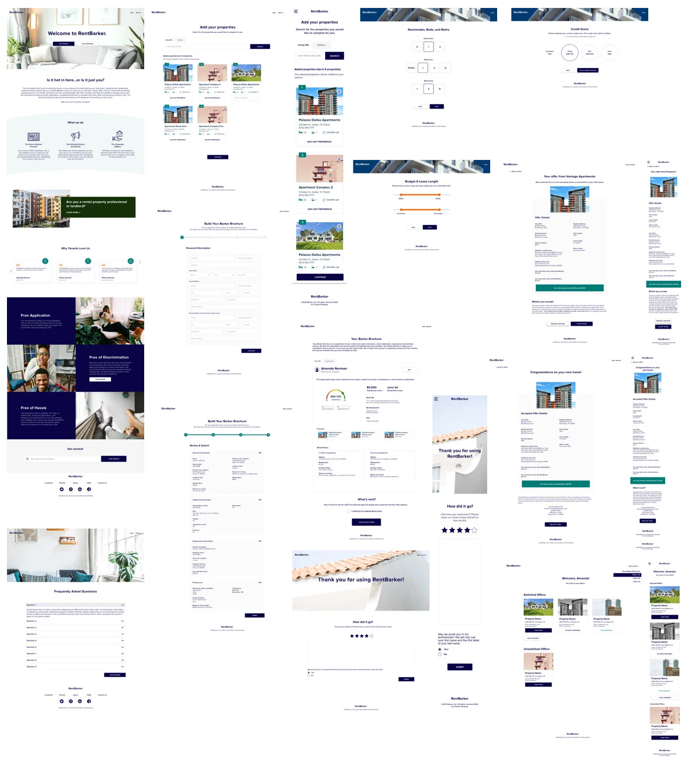
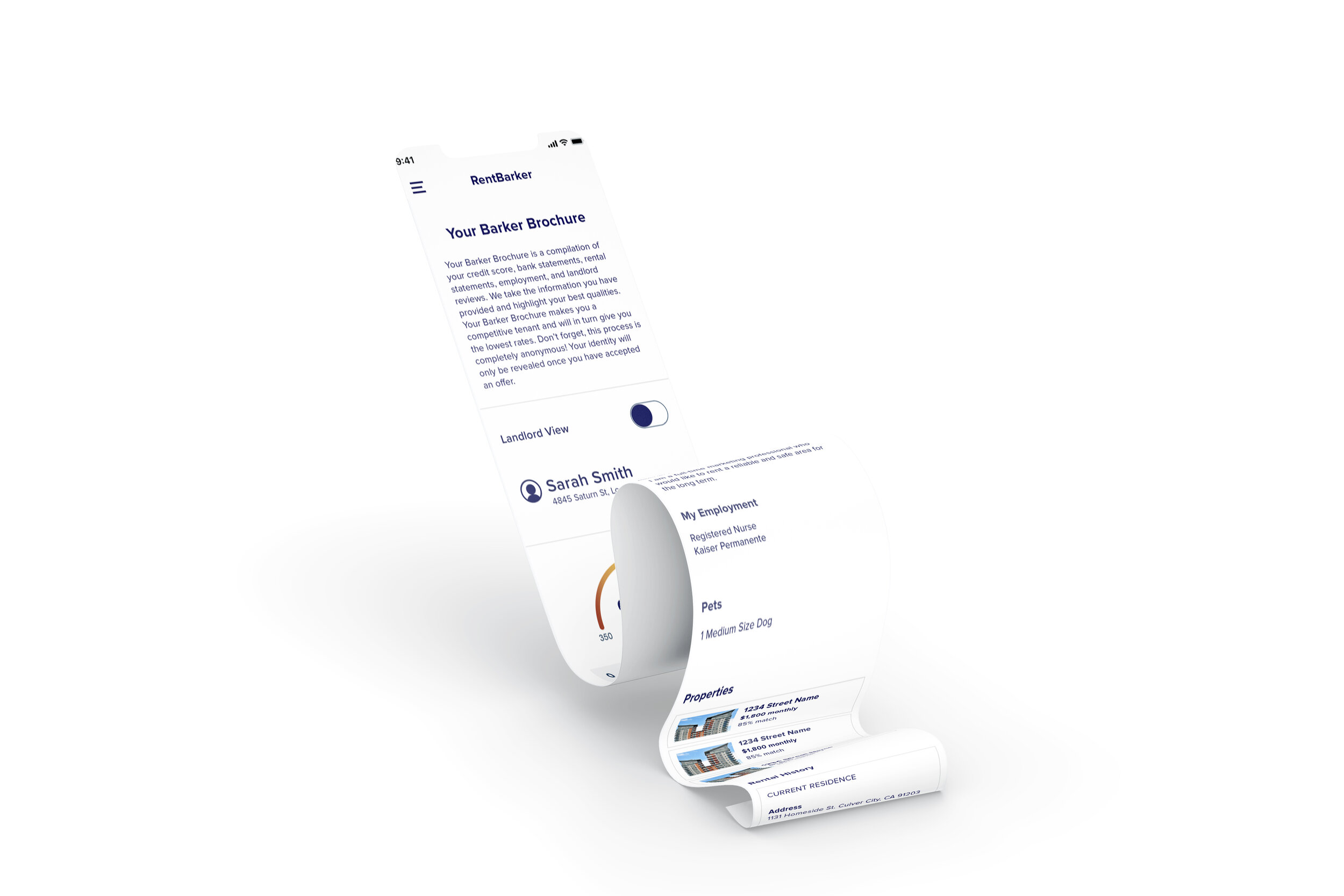
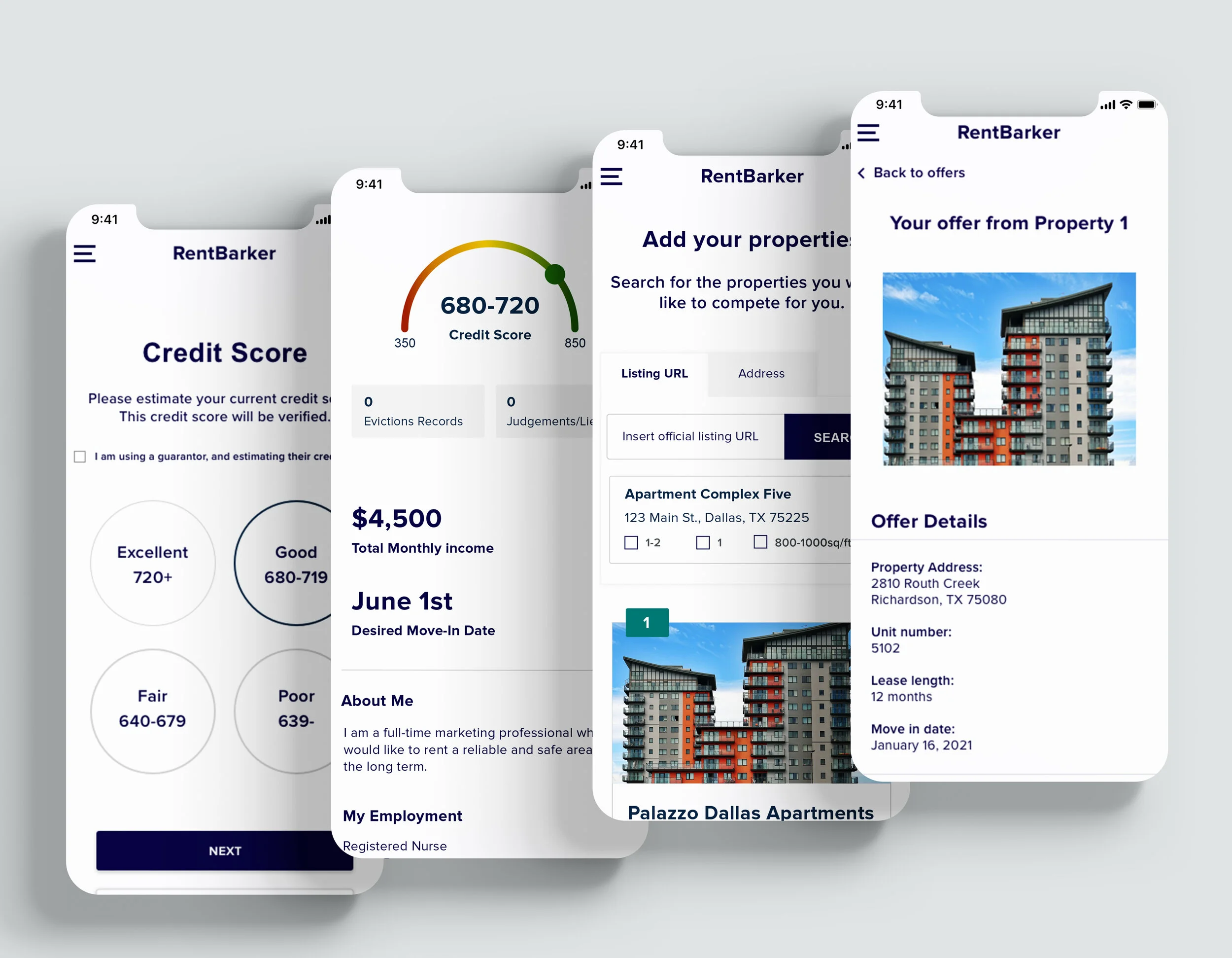
High Fidelity Wireframes and UI
I was the sole UI-UX designer for the tenant side of the RentBarker website. I created high fidelity wireframes that contained every page (and version of a page) where a tenant might find themselves throughout their time on the site. I altered, refined, and edited these wireframes for months. I worked closely with the team to implement suggestions and desired changes. I was in close communication with our developer to make sure everything translated smoothly into code. I uploaded all of my Sketch files to Zeplin so that our developer could easily pull elements and exportable objects from the files into his programs.
Please contact me if you are interested in seeing a more robust and complete version of these high fidelity wireframes.
Takeaways
Adaptability and flexibility
Startups are incredibly fast-paced and constantly evolving. At RentBarker, I learned how to quickly switch gears and alter my UX processes based on stakeholder needs.
Lean UX methods
Implementing lean UX methods was key to RentBarker. I was constantly sketching, designing, presenting my designs, and having the team critique them until the designs were validated. As I iterated, the product became further and further refined, resulting in an amazing MVP.
Stakeholders and users
I learned how to balance both listening to the stakeholders and fighting for the users.