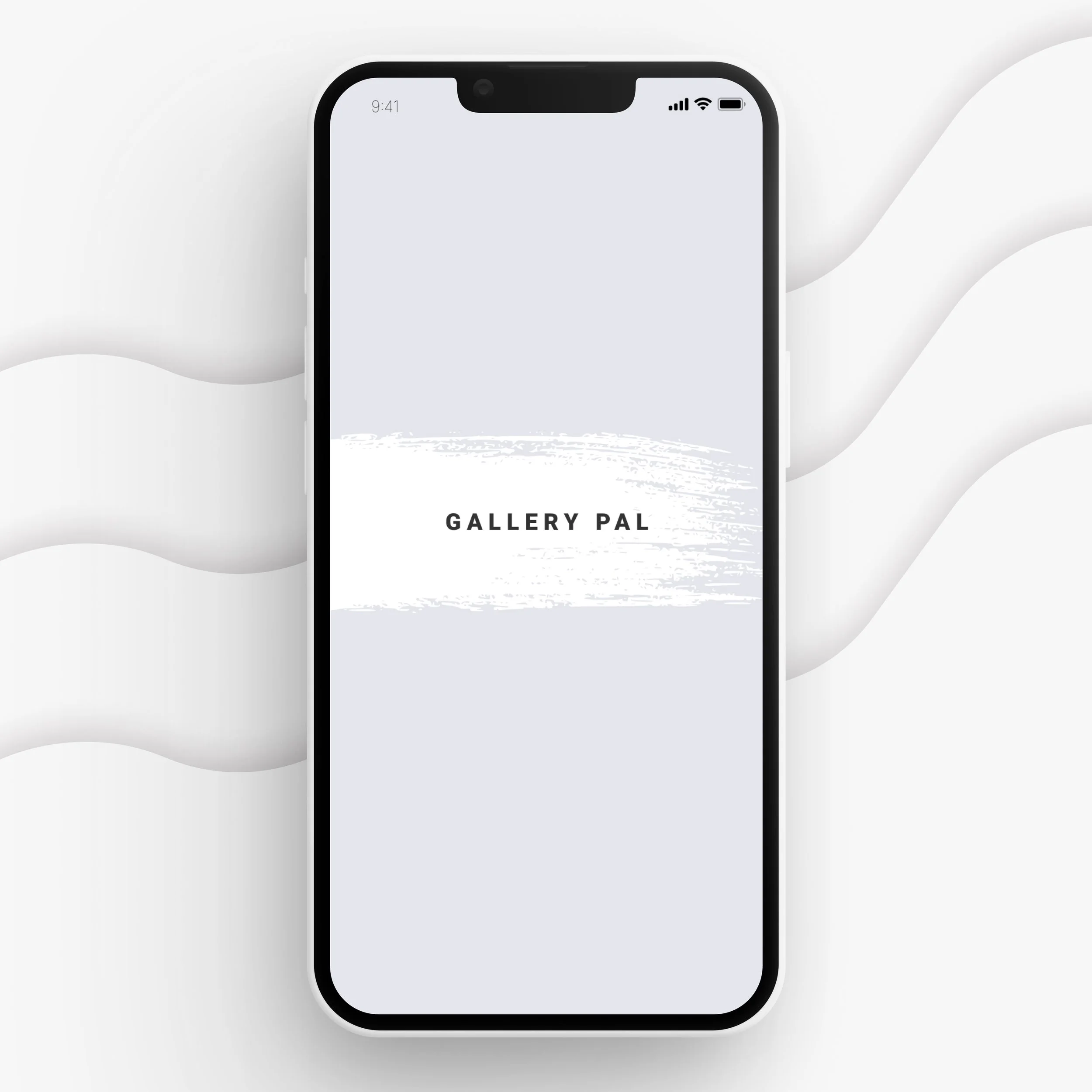
Gallery Pal
Introducing Gallery Pal - the must-have pocket-sized tour guide for museum visitors. No more noisy guides or large groups to navigate around. Enjoy a personalized and peaceful browsing experience, with all the information you need right at your fingertips.

My Role
As the sole product designer on this project, I created an end-to-end user experience for Gallery Pal. Through several key discovery and design phases, I created an MVP of Gallery Pal to enhance the everyday museum visitor’s experience, reduce their stress, and negate imposter syndrome.
Problem
Museum visitors struggle for instant access to information about pieces they are viewing in real-time. Visitors want to find a way to individually view pieces, and instantly access important and engaging information on each one of them.
Solution
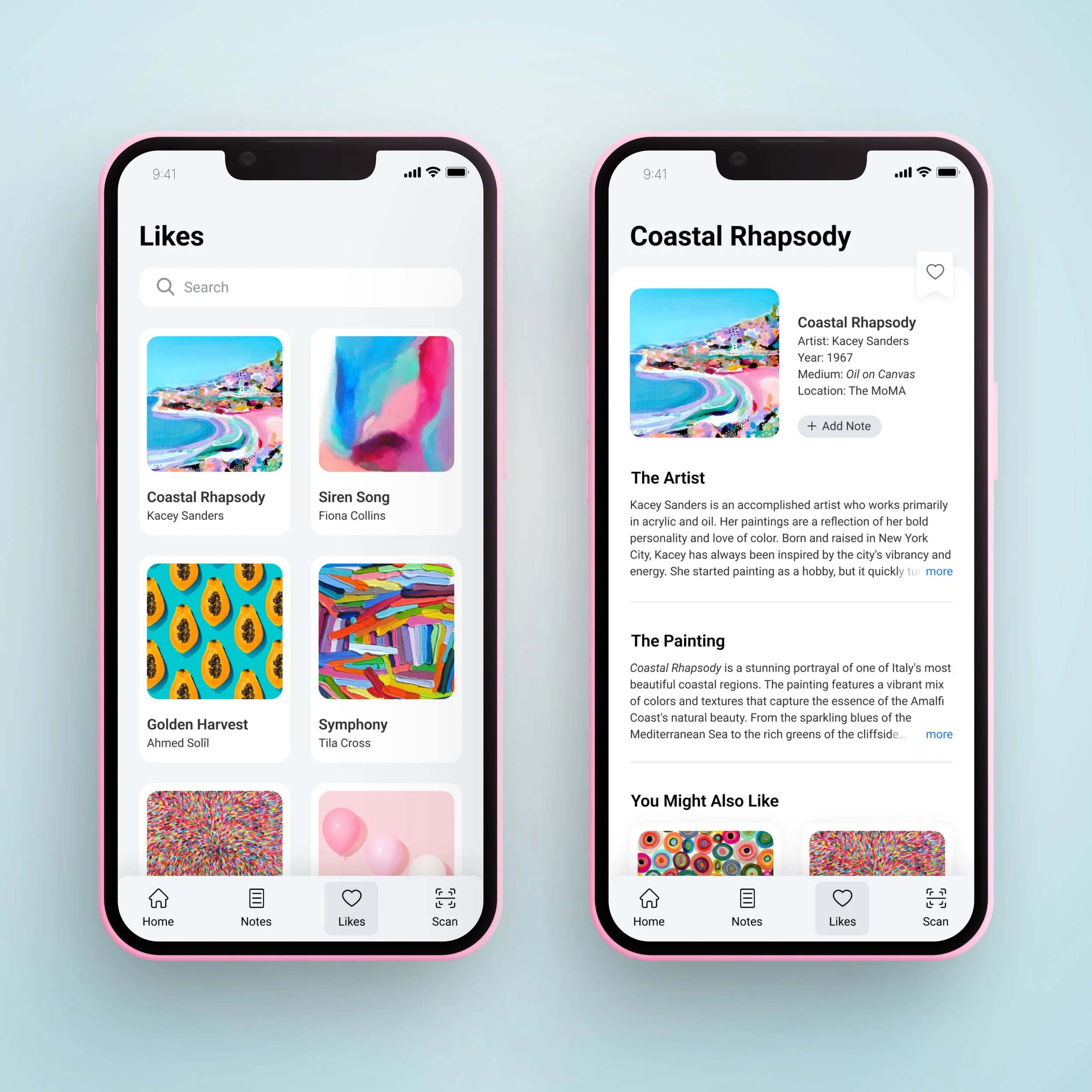
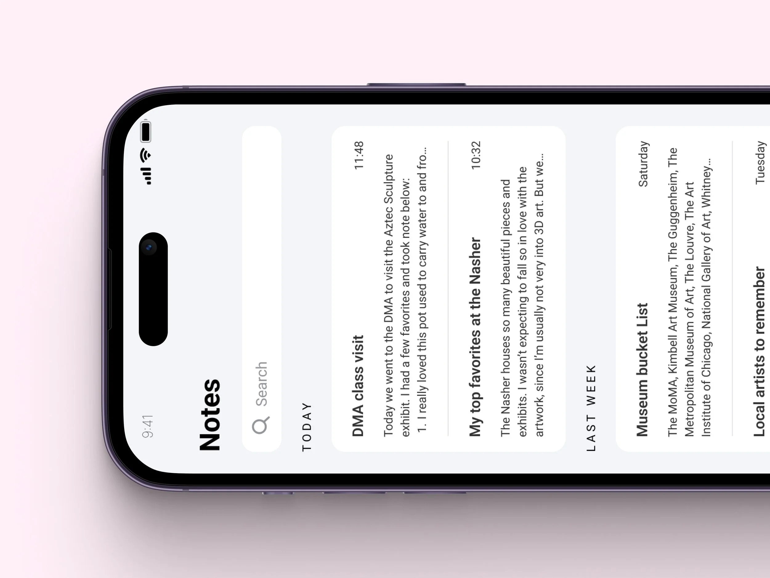
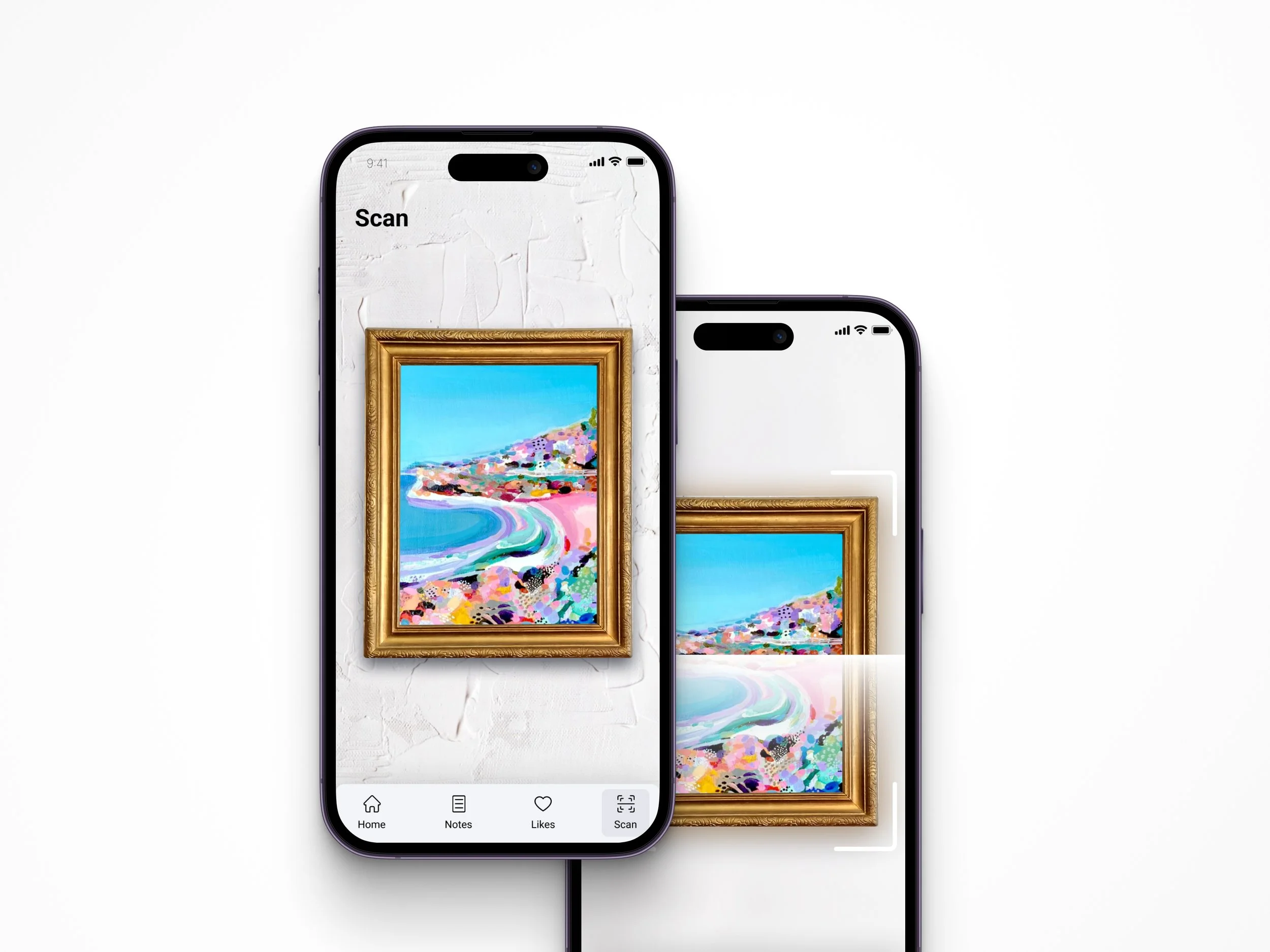
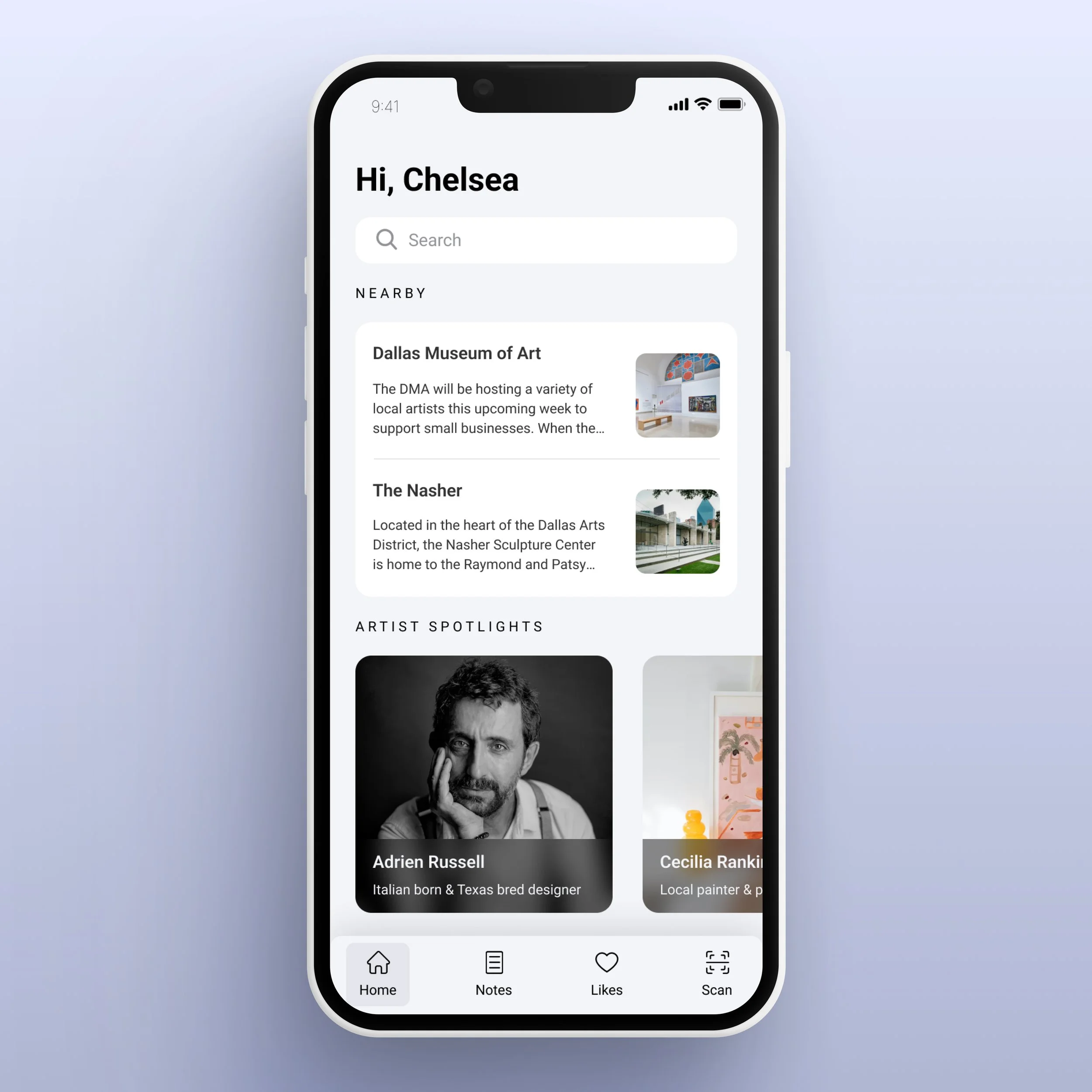
Gallery Pal simplifies art research for museum visitors by enabling them to scan paintings in the gallery, access information about the artwork and artist, view interesting facts, favorite a painting, learn about its history, and make notes on their personal interpretations.
Key Phases
Storyboard
Low Fidelity Wireframes & User Testing
User Interface Design
High Fidelity Wireframes
Prototype
Review Research & Interviews
Persona
Key Insights
Journey Map
Lighting Demos
Crazy Eights
Review Research & Interviews
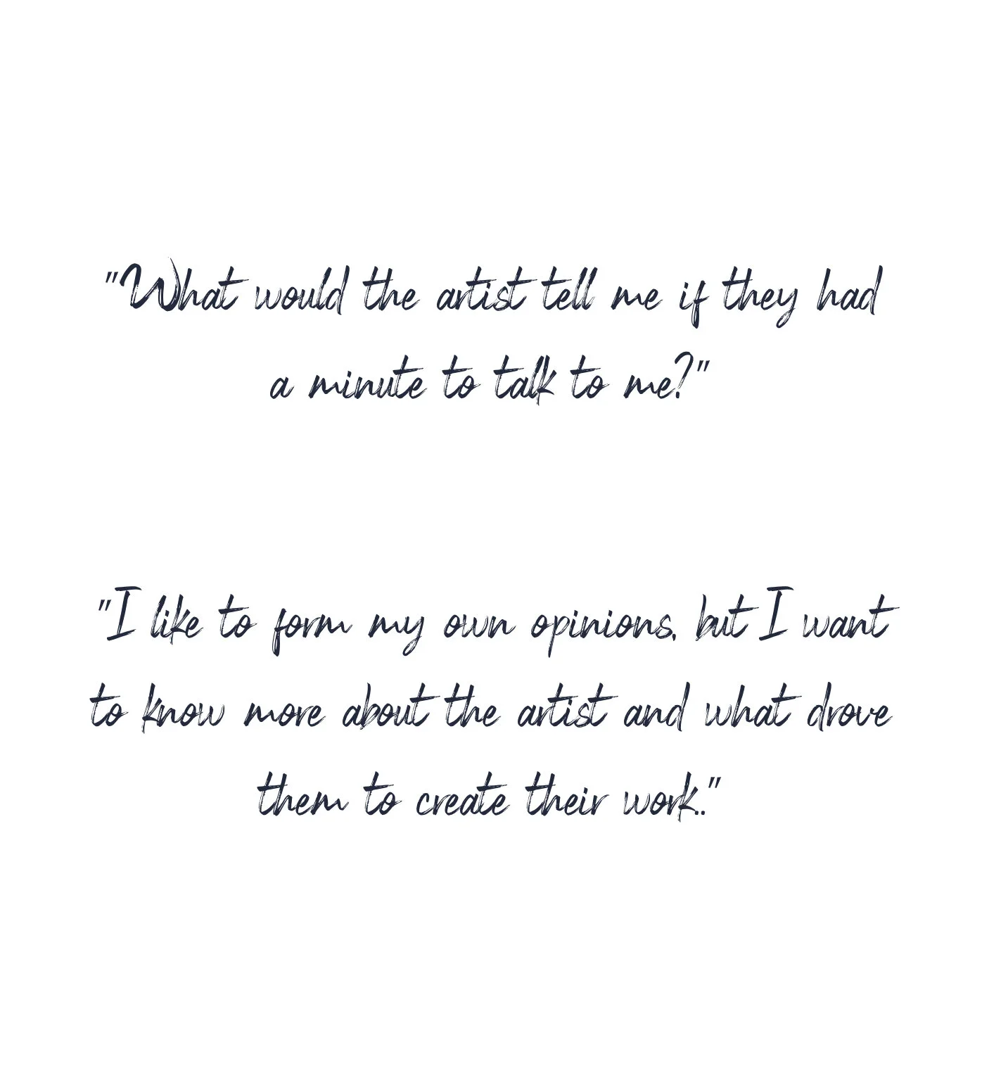
The goal of this project was to increase customer satisfaction when viewing art. To begin, I needed to understand exactly what customers were not satisfied with. My interviews and research gathered that customers wanted to learn more about the artist’s technique and processes. Museum visitors would find themselves overwhelmed with all of the research presented to them when they wanted quick access to this information on their mobile devices. It should be also be noted that these gallery-goers preferred to roam the museum on their own and without a tour guide.
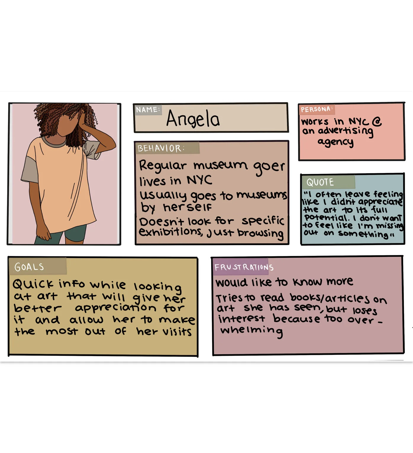
Persona
Based on my research and interviews, I created my persona: Angela. Angela is a frequent museum-goer and often feels like she is leaving the museum without being able to appreciate the art. Researching the art before or after the fact is overwhelming for viewers and they often get lost in a sea of articles and academia when trying to learn more in a short period of time. I focused on Angelas’s behaviors, frustrations, and goals as a museum customer. Angela represents the feelings and frustrations of those interviewed. I kept Angela closely in mind as I created my key insights.
Key Insights
Art museums can be overwhelming for visitors who are unfamiliar with the pieces on display. Small blurbs provided next to the pieces can only provide so much information. Even seasoned museum-goers can benefit from tours that offer fun facts and anecdotes about the artists, helping to engage and connect with the pieces on a personal level. However, not everyone wants to take a tour or have a group experience. For those who prefer a more solitary exploration of the museum, it can be challenging to obtain the same learning experience. Through research and my persona, Angela, I identified two key insights to address these challenges:
Viewers want to individually view pieces and be able to instantly access important and engaging information on each piece.
Viewers are frustrated and overwhelmed when trying to research the art they are interested in.
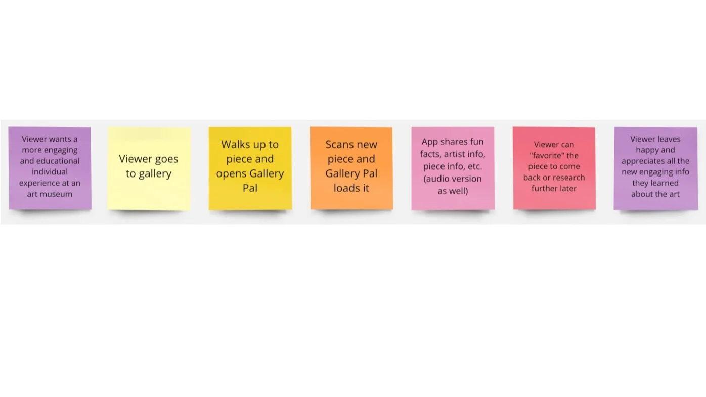
Journey Map
After developing my key insights and addressing my questions, I used Miro to create a short journey map of the ideal user experience for Gallery Pal. Users can scan art pieces to learn fun facts, artist information, techniques, processes, and processes. They can also “favorite” pieces and take notes on what they’ve learned to revisit later.
Lightning Demos
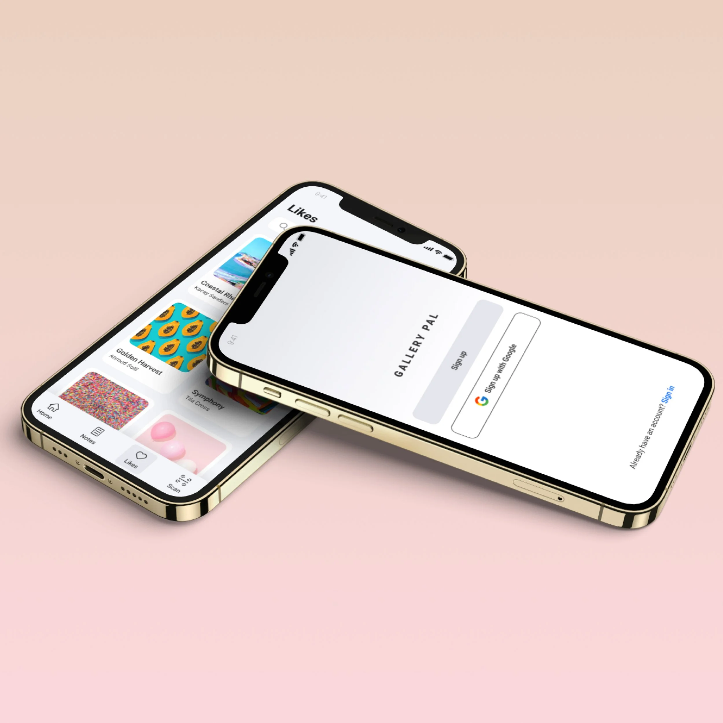
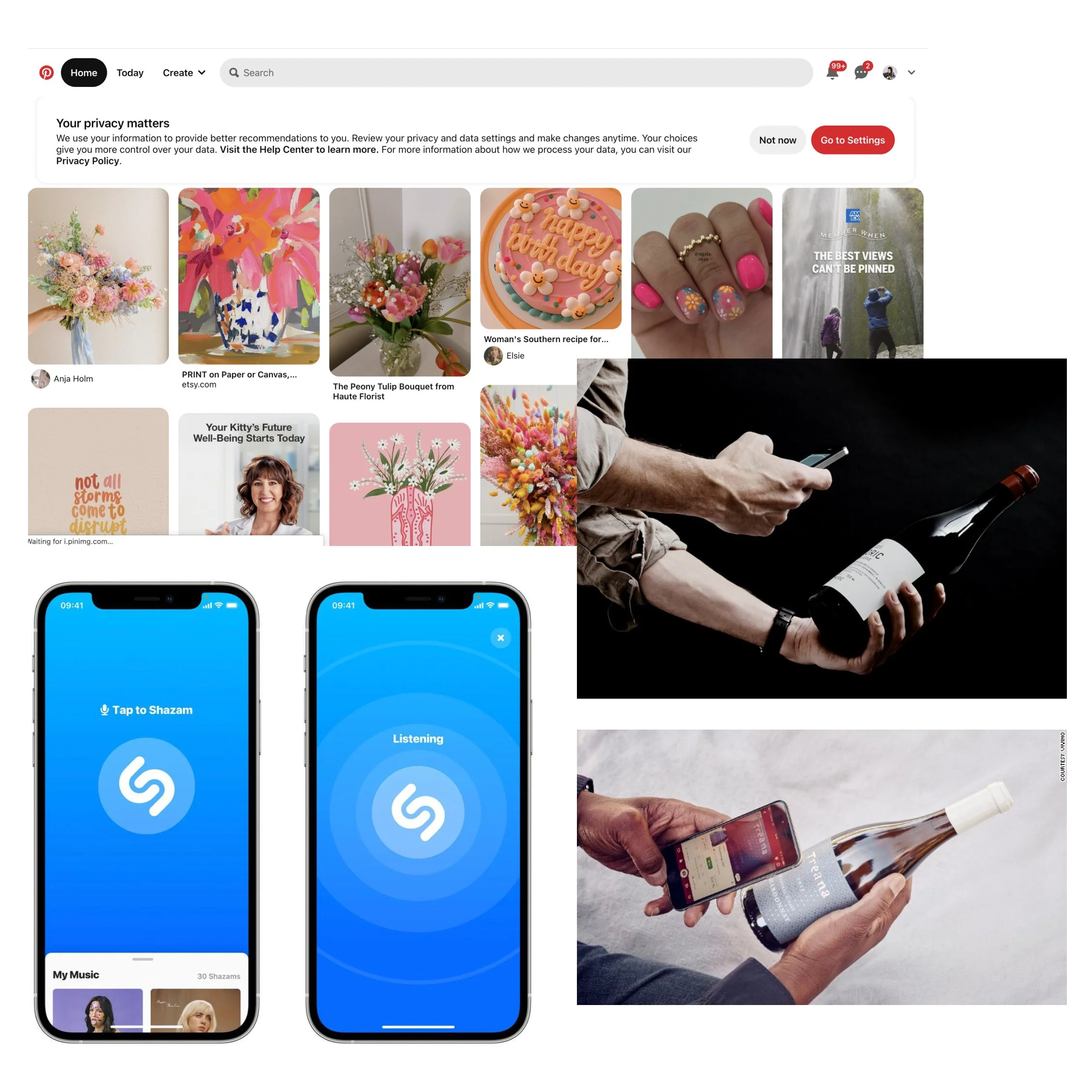
I drew inspiration from three applications that offered valuable qualities. Vino is a wine-searching app that allows customers to scan wine labels and access relevant information, ratings, and reviews. Secondly, Shazam, an app that listens to and identifies songs, served as a model for Gallery Pal's readiness, availability, and instant identification for museum visitors. Lastly, Pinterest's feature to save and create boards was inspirational and led to the creation of similar functionality for users to save and revisit their favorite art pieces from galleries.
Crazy Eights
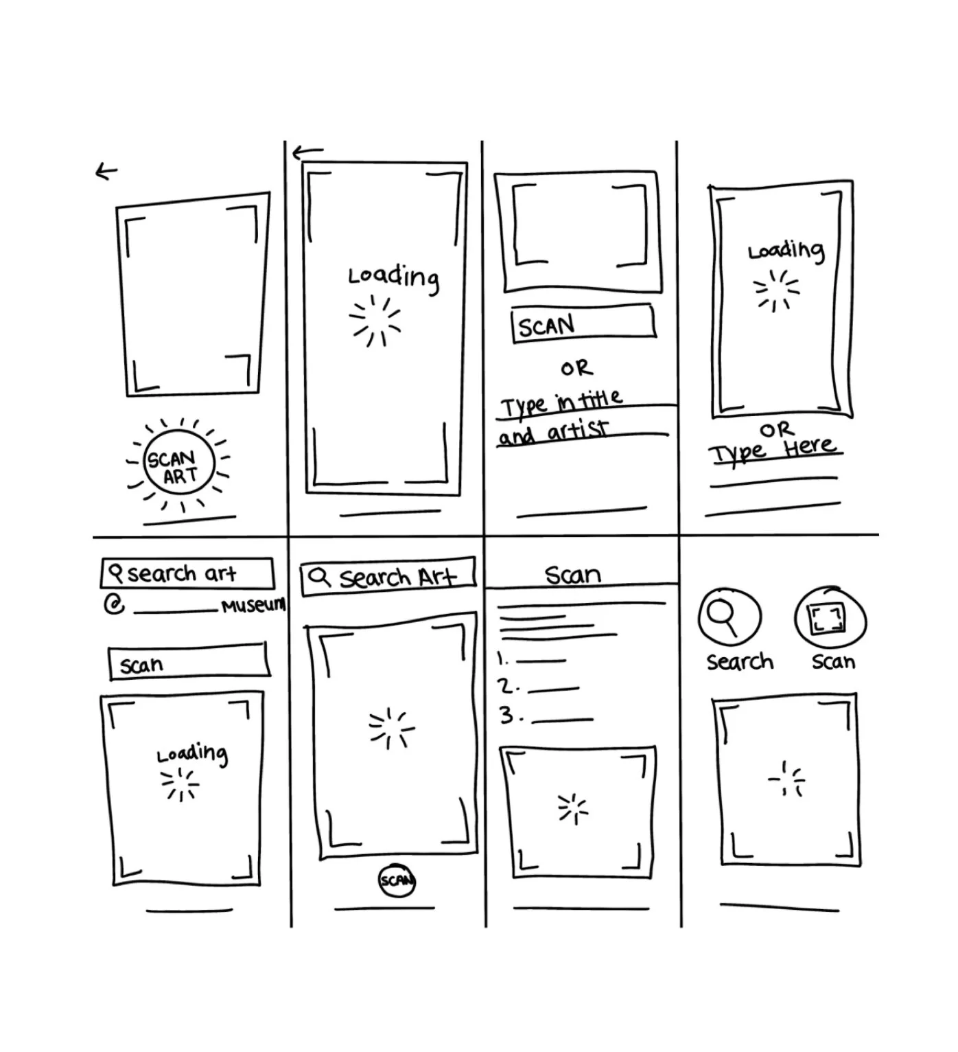
This unique design sprint method was meaningful to use, as I had found myself stumped on the best way to format the most valuable page: the scanner. I gave myself eight minutes to design eight different page layouts. The time constraint was very helpful due to the fact that I didn’t have time to get stuck modifying and refining a single design. I needed to keep moving to different ideas and layouts.
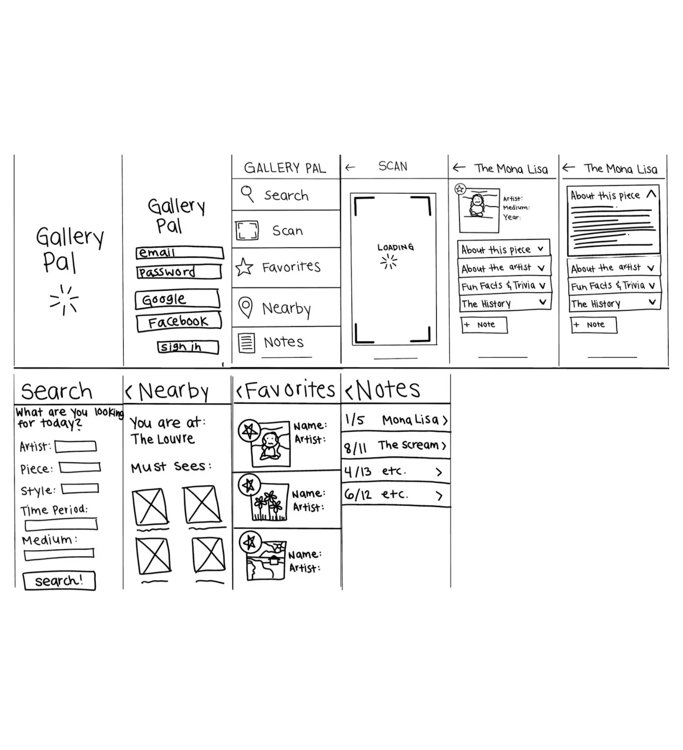
Storyboard
Once I had finished my crazy eights, I had a great jumping-off point for the rest of the application. I quickly sketched out the layouts of other key pages before beginning my low fidelity wireframes.
Low Fidelity Wireframes & User Testing
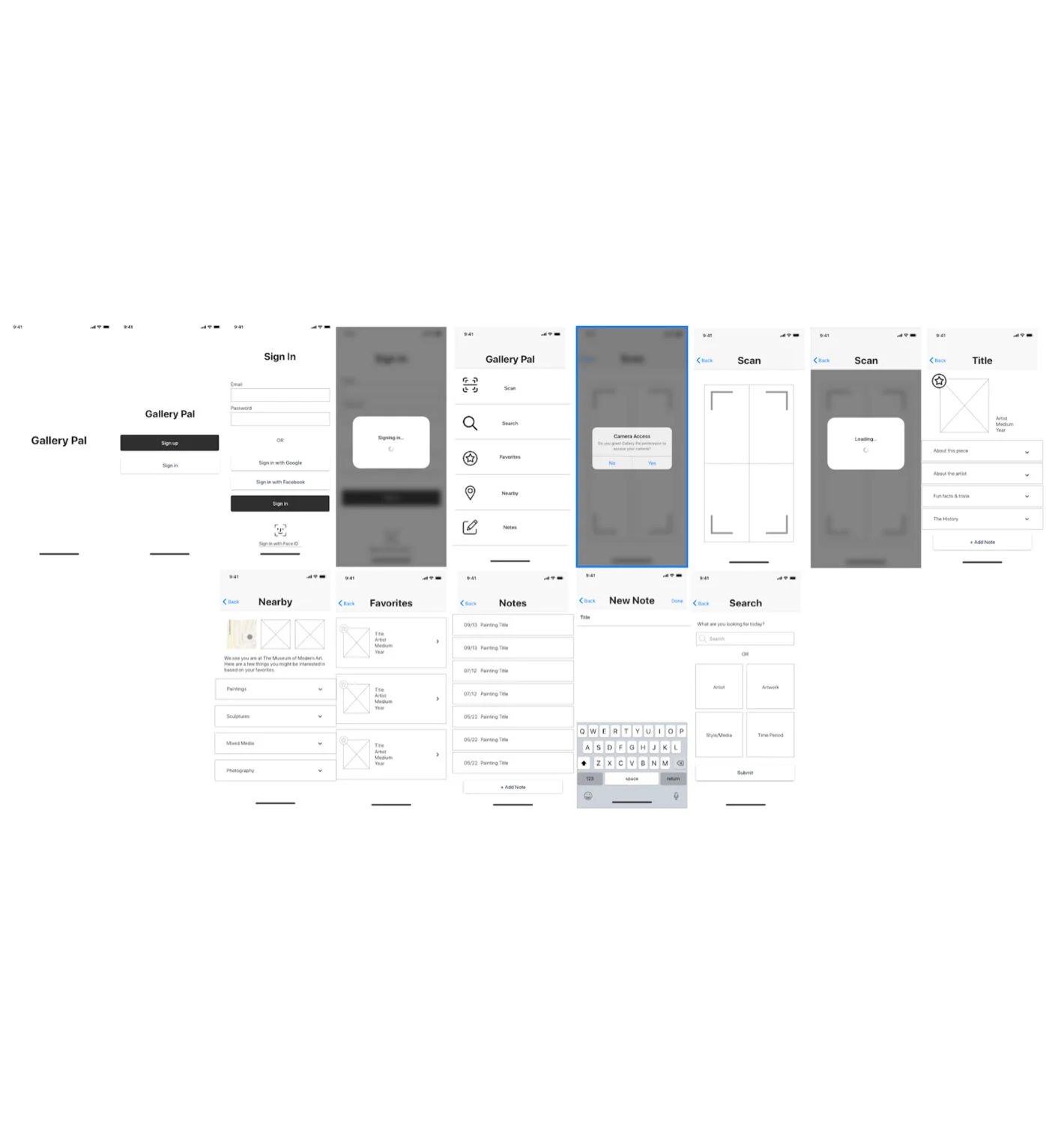
I created low fidelity wireframes based on my sketches. I used Sketch to quickly organize the page layouts and proceeded with Invision to create a clickable prototype for user testing. I tested the Gallery Pal flow on five people, and the experiences were pleasant. There were very few comments on current areas to improve, with the exceptions of minor copy changes and valuable additional features to add.
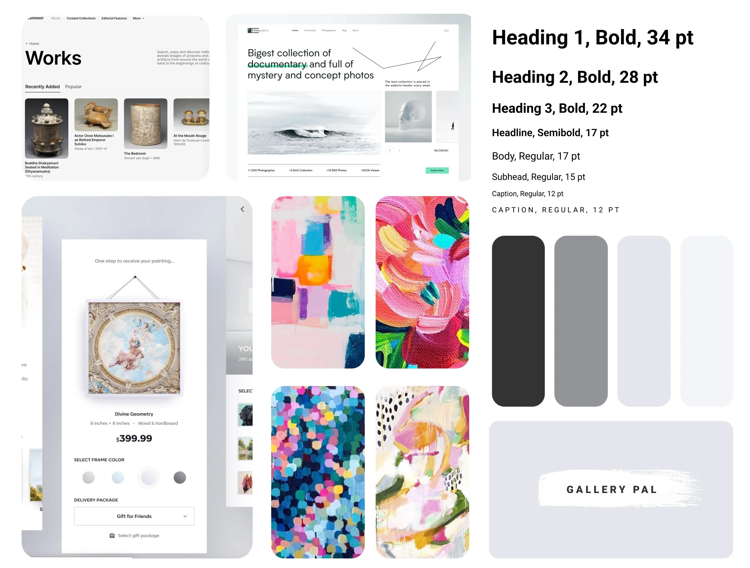
User Interface Design
I wanted Gallery Pal to have a very soft and neutral color scheme. When a visitor is at a museum, they are focused on the art that they are viewing. Gallery Pal is a tool that is intended to highlight the art users choose to scan, save, and view. Adding anything but neutral colors would be an unwelcome distraction to the viewer. There are bright paintings in the Gallery Pal mood board, and the neutral colors allow the colors in the paintings to stand out. If the mood board was filled with bright colors, the paintings would be much less noticeable and likely overlooked. I took note of this and began my high-fidelity wireframes.
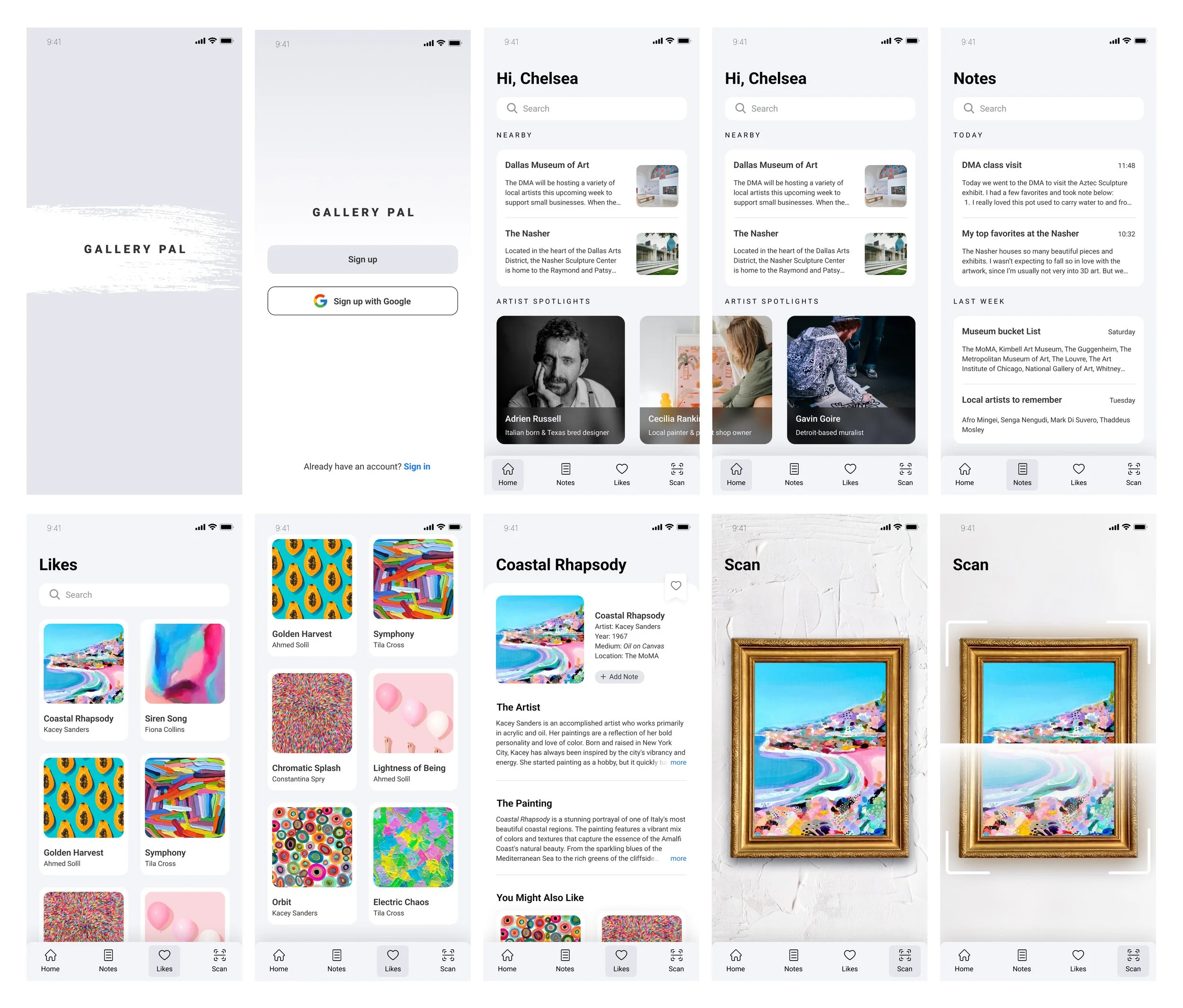
High Fidelity Wireframes
I subtly implemented my color scheme into my high fidelity wireframes. I added the iconography, logo, colors, and images. Similar to the mood board, the colors of the paintings were bright and vibrant up against the soft color palette. I changed the wording based on the suggestions from previous user testing and placed it into Invision to make a clickable prototype.
Takeaways
Allow the content to stand out.
When designing the user interface, especially for an application that showcases gallery art, choosing a color palette that was anything other than neutral would have been a huge misstep. My ultimate goal was to have the paintings and content stand out over the colors of the application itself.
Work smarter AND harder
This design sprint was incredibly fast-paced, and I learned valuable methods to work efficiently and maintain the production of meaningful designs.